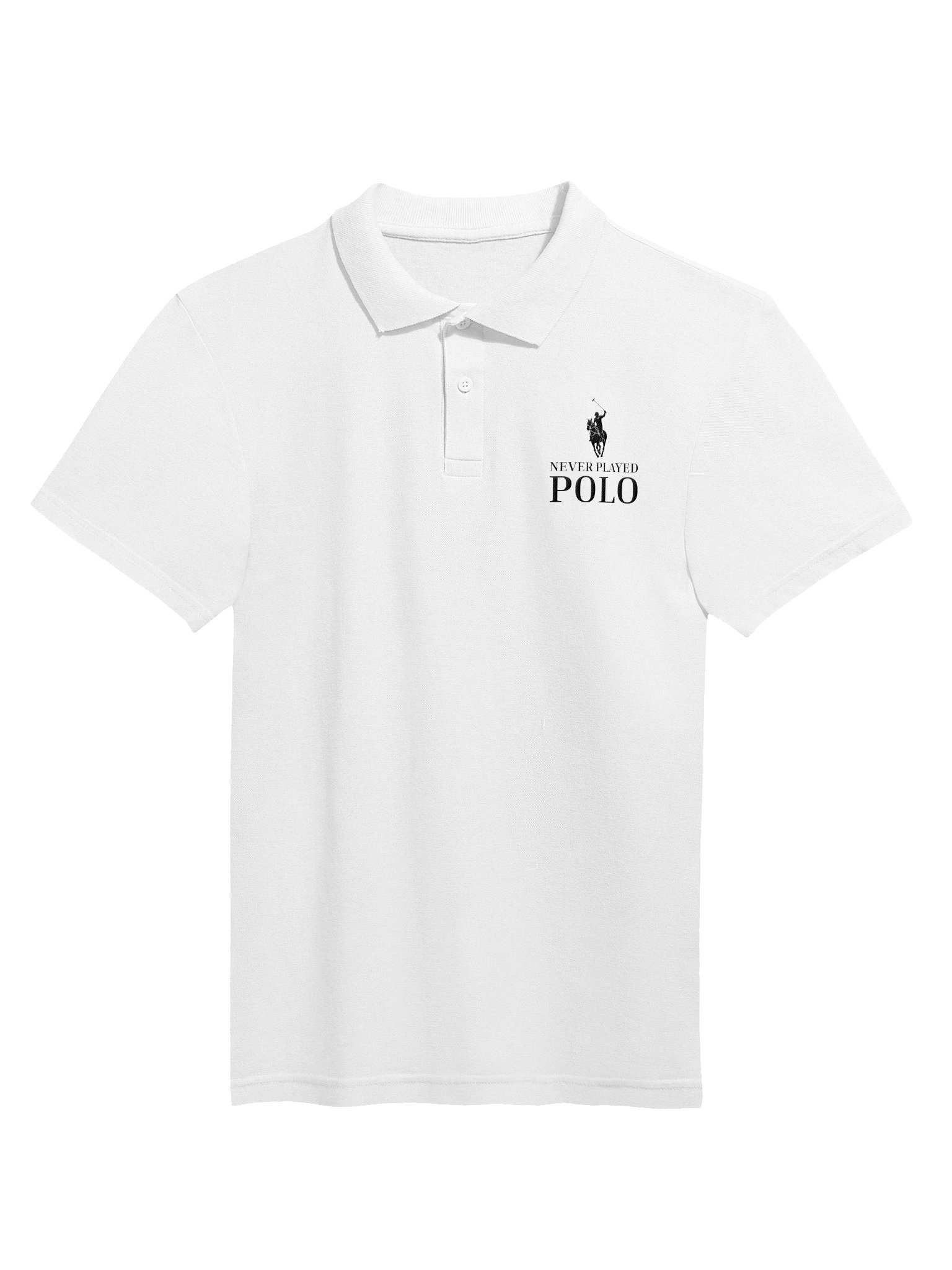
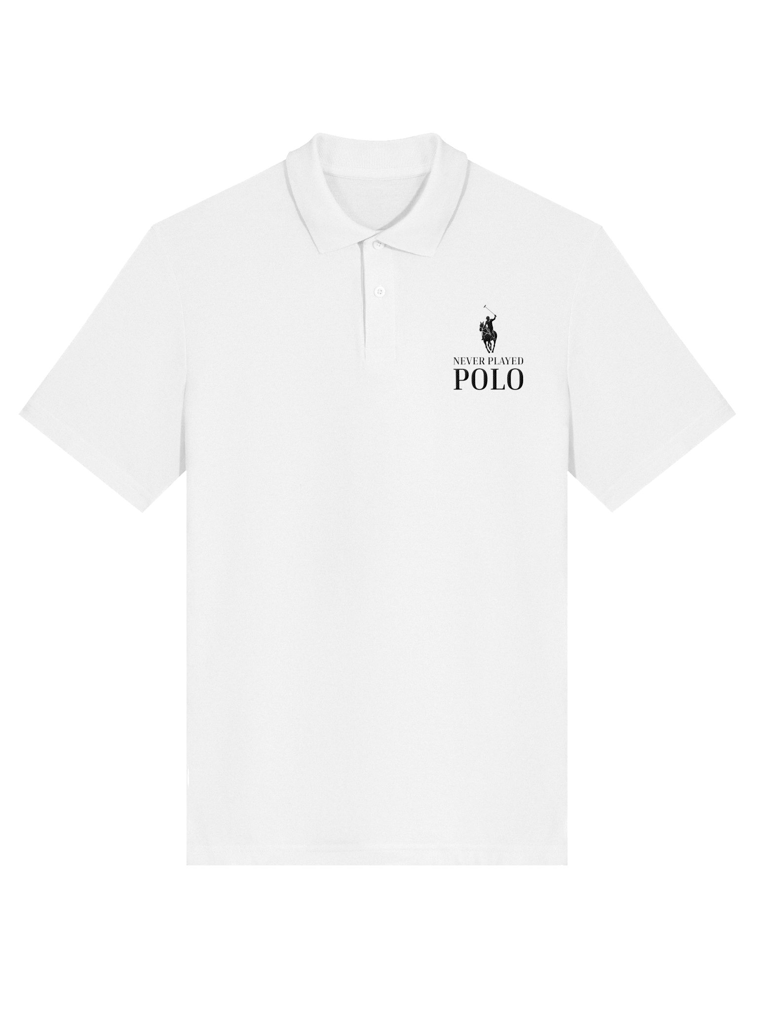
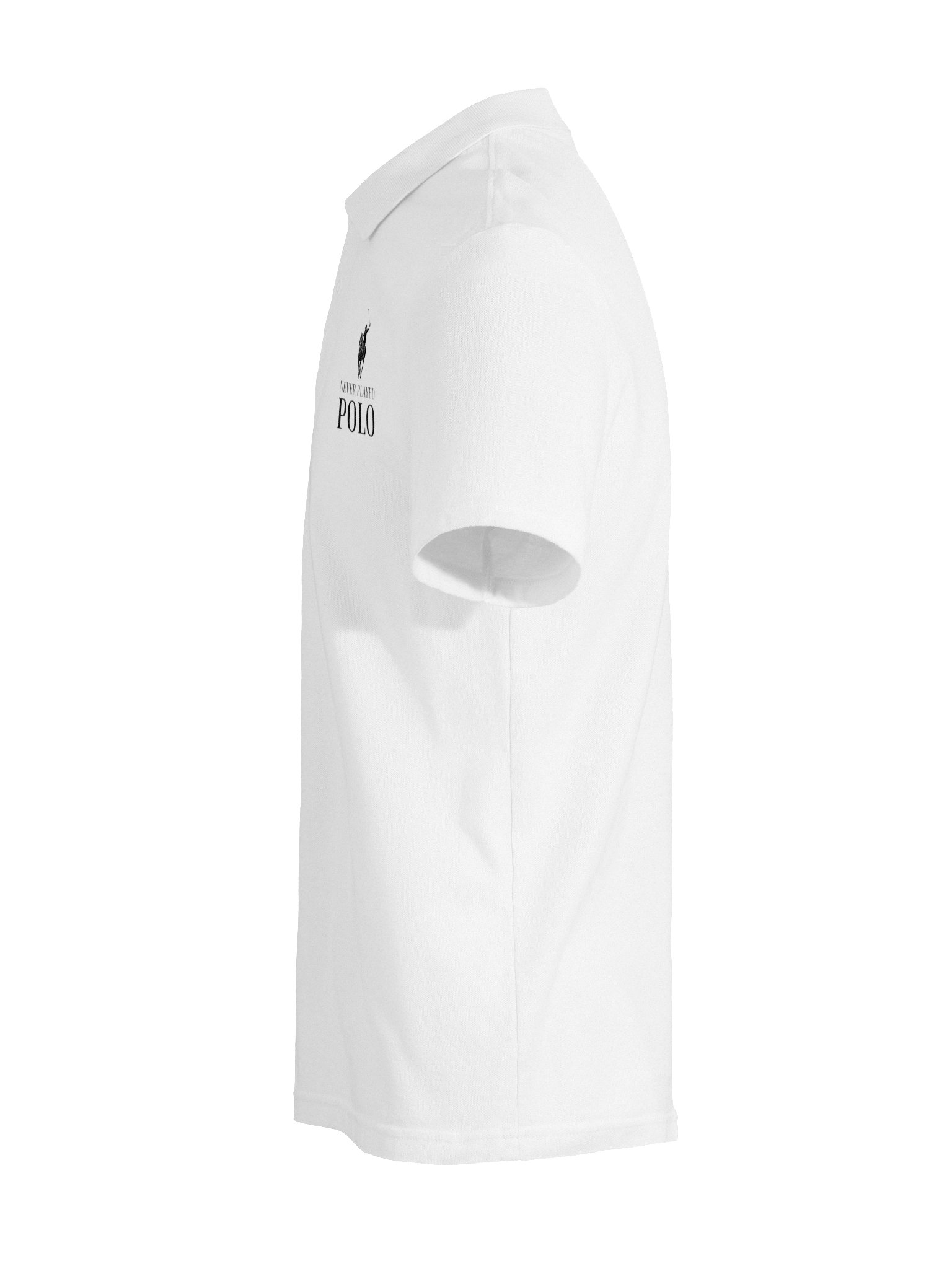
The logo doesn’t have to be subtle
Modern branding has also blurred the line between logo and decoration.
A tiny embroidered symbol in the corner is one thing.
A giant logo across the entire shirt is another.
Brands can repeat monograms, enlarge symbols, cover garments in recognizable patterns or turn their own names into the graphic composition.
At that point, the branding isn’t sitting quietly in the corner anymore.
The branding is the design.
Sometimes that’s genuinely good design. A strong logo can be visually interesting, and incorporating it into a composition can produce something much better than simply dropping a company name onto a blank shirt.
But there’s still a difference between wearing an interesting design and wearing a particularly elaborate advertisement.
That doesn’t mean everyone should wear anonymous beige clothing and spend the rest of their lives whispering about minimalism. But there’s a difference between wearing a brand and wearing an idea.
One puts the company at the center.
The other puts the design at the center.
That’s a distinction Paak Design cares about.
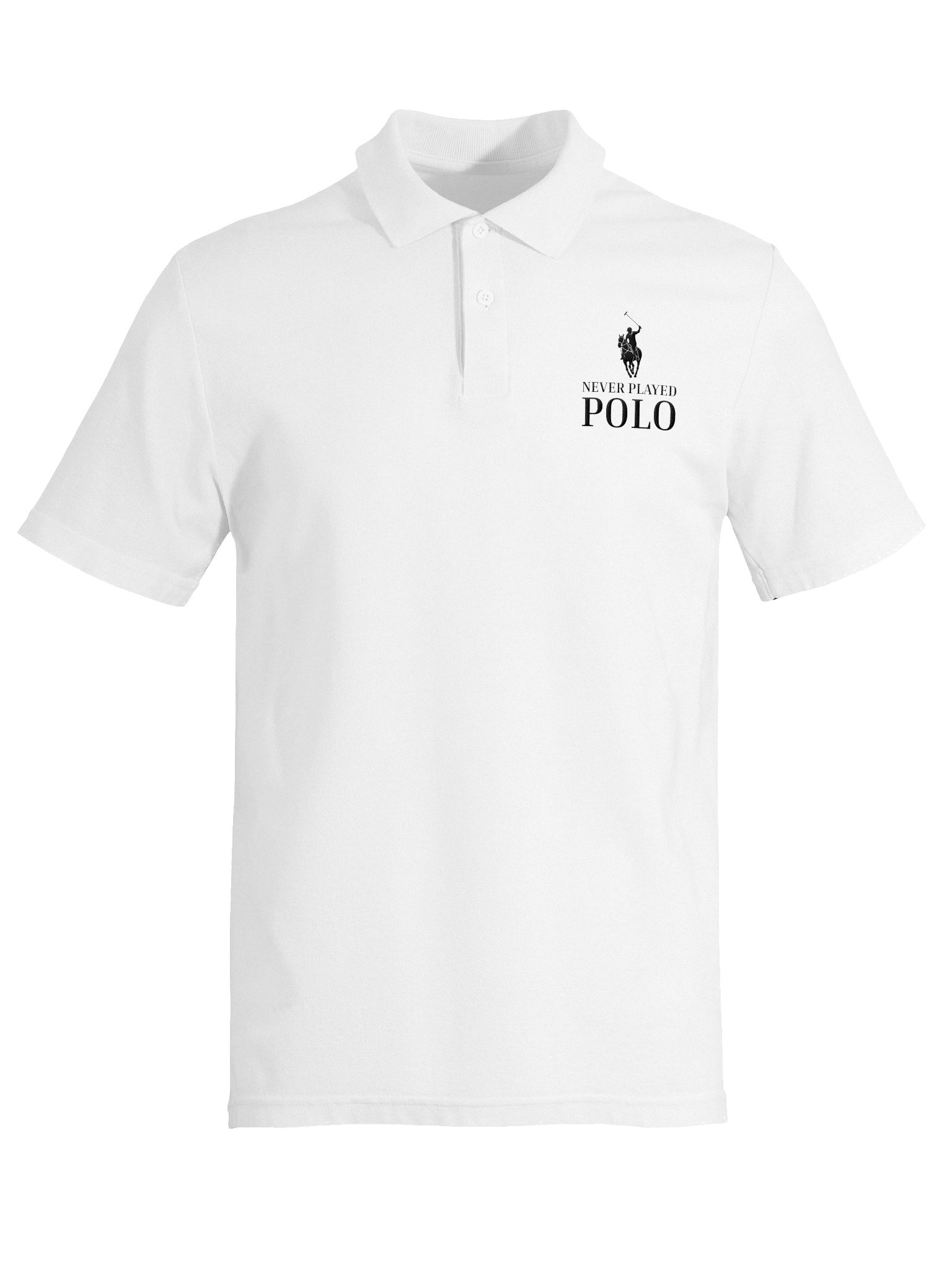
Paak doesn’t put its own logo on its products. The point isn’t to turn the customer into a billboard for Paak. The design is supposed to stand on its own.
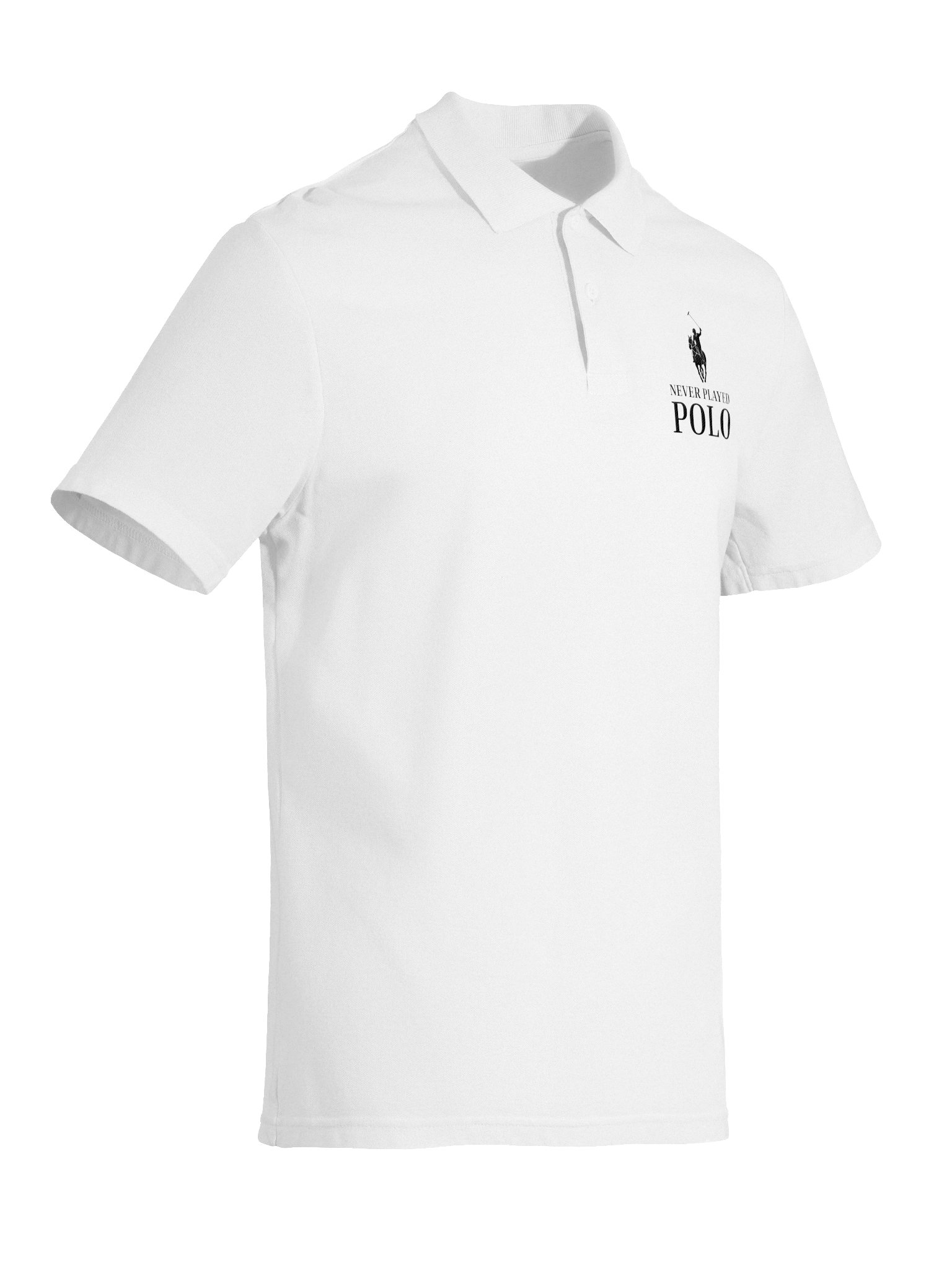
Sometimes that means parodying the logos people already know. Sometimes it means turning an everyday observation into a graphic. Sometimes it means making something that has absolutely nothing to do with fashion at all.
The company name isn’t the interesting part.
The idea is.
And maybe that’s a better reason to put something on your chest.