Every logo on a shirt is doing a job: telling people what group you’re in, what you can afford, or whose taste you’re borrowing for the day.
Here are nine that do it differently.
Every logo on a shirt is doing a job: telling people what group you’re in, what you can afford, or whose taste you’re borrowing for the day.
Here are nine that do it differently.
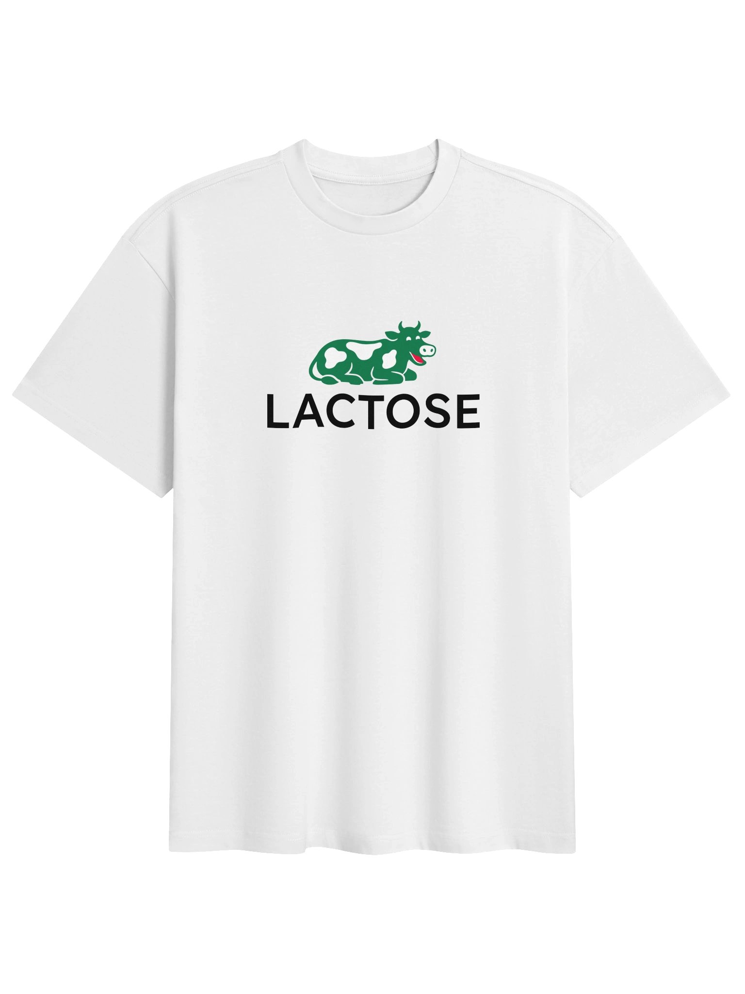
Lacoste’s crocodile has been quietly signaling “I play tennis, or at least I own the outfit for it” since 1933. Lactose swaps the crocodile for a green cow, spots and all, and suddenly the whole thing reads differently. It’s not mocking tennis. It’s mocking the idea that a reptile on your chest tells anyone anything real about you. The cow doesn’t play tennis either, but at least it’s not pretending.
The seams haven’t become more carefully stitched.
Yet the second shirt can command a completely different price because people aren’t only buying the physical shirt. They’re buying what the name means.
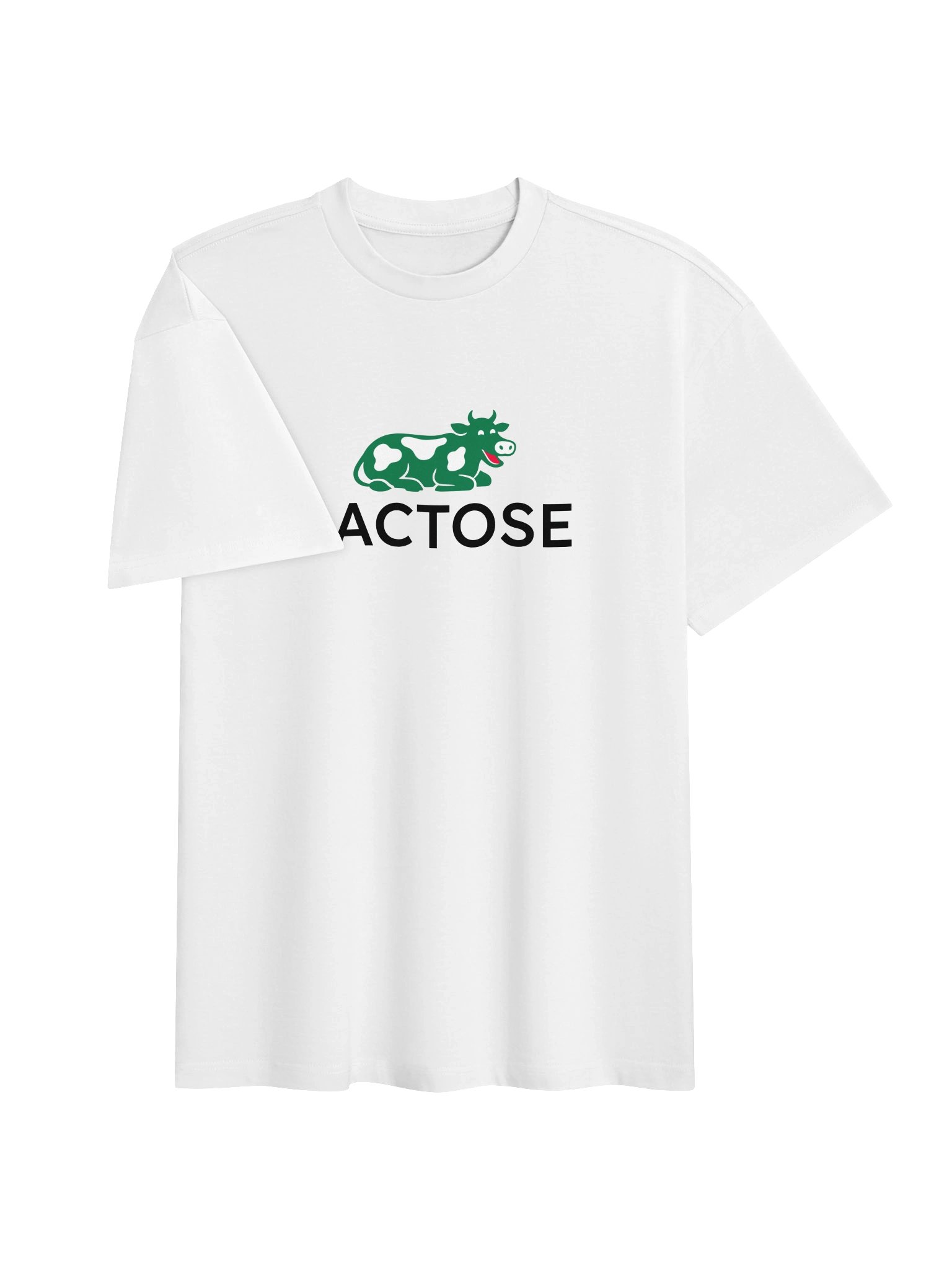
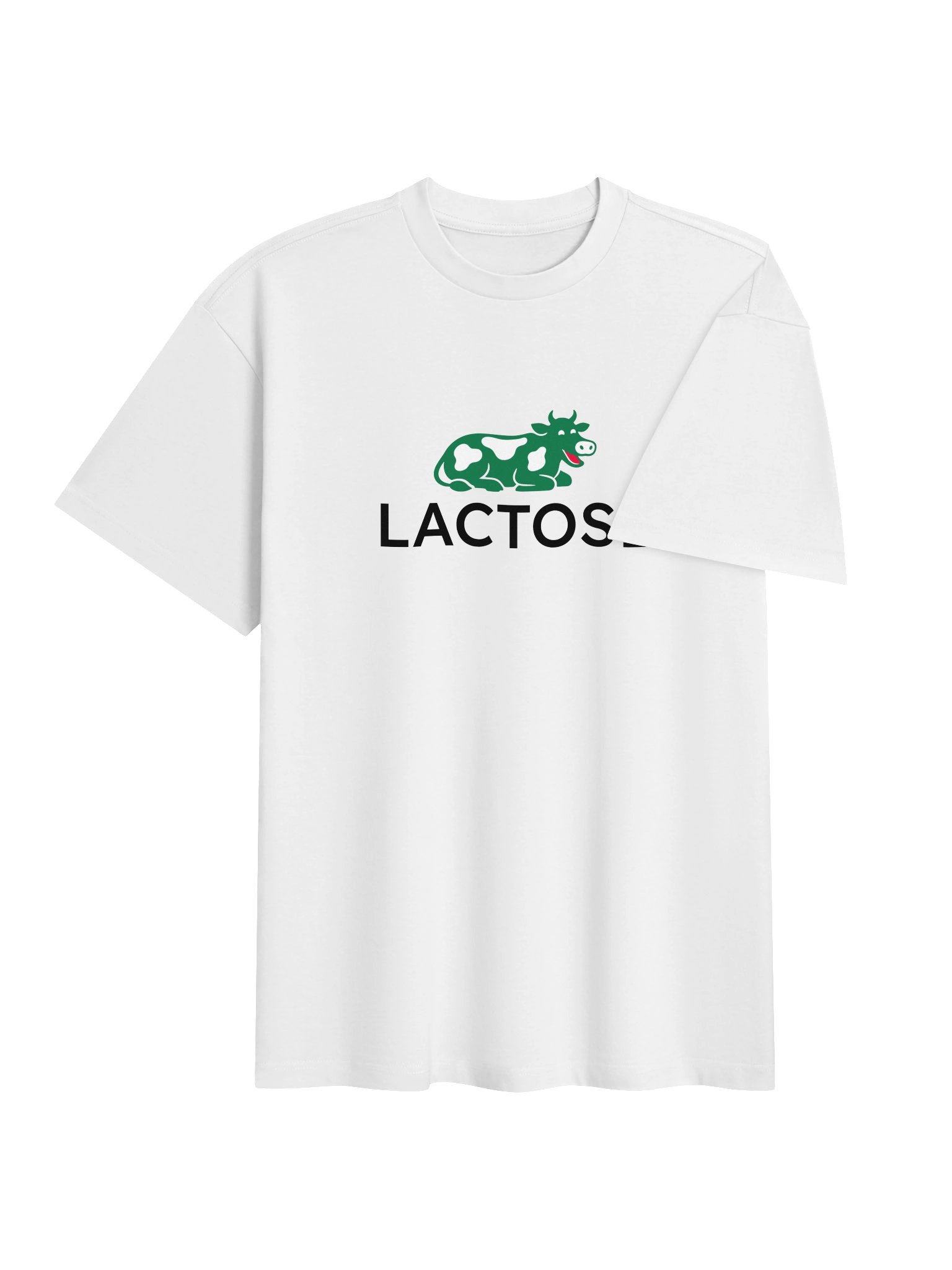
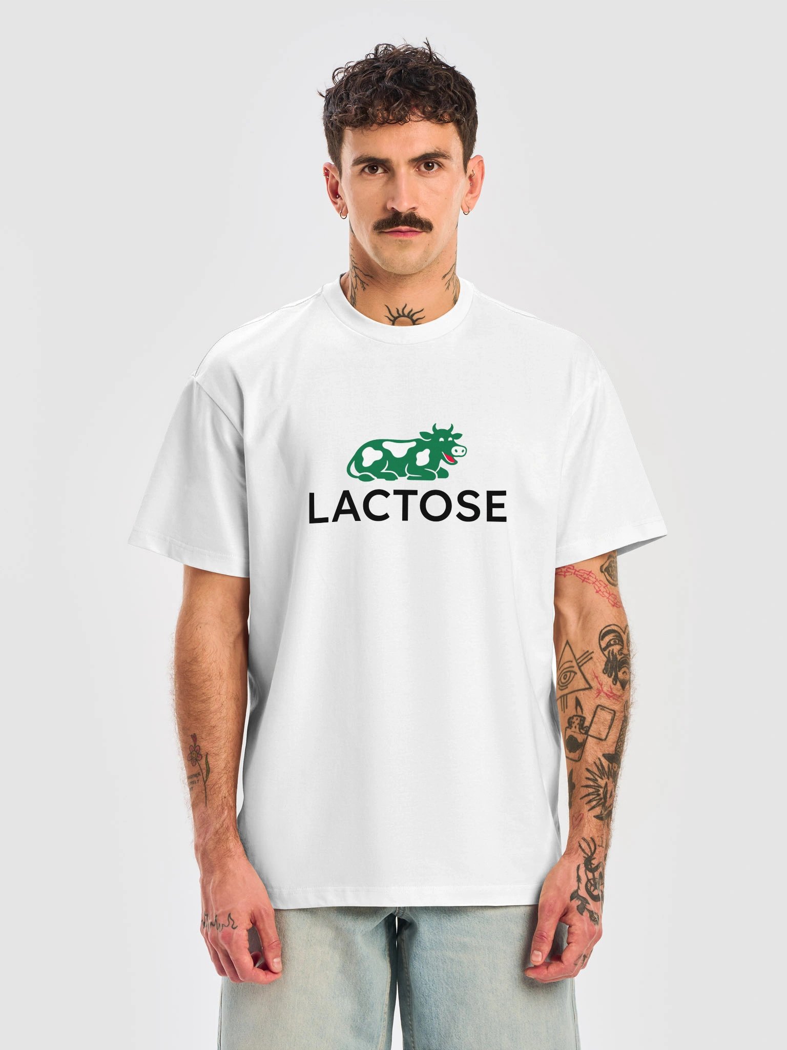
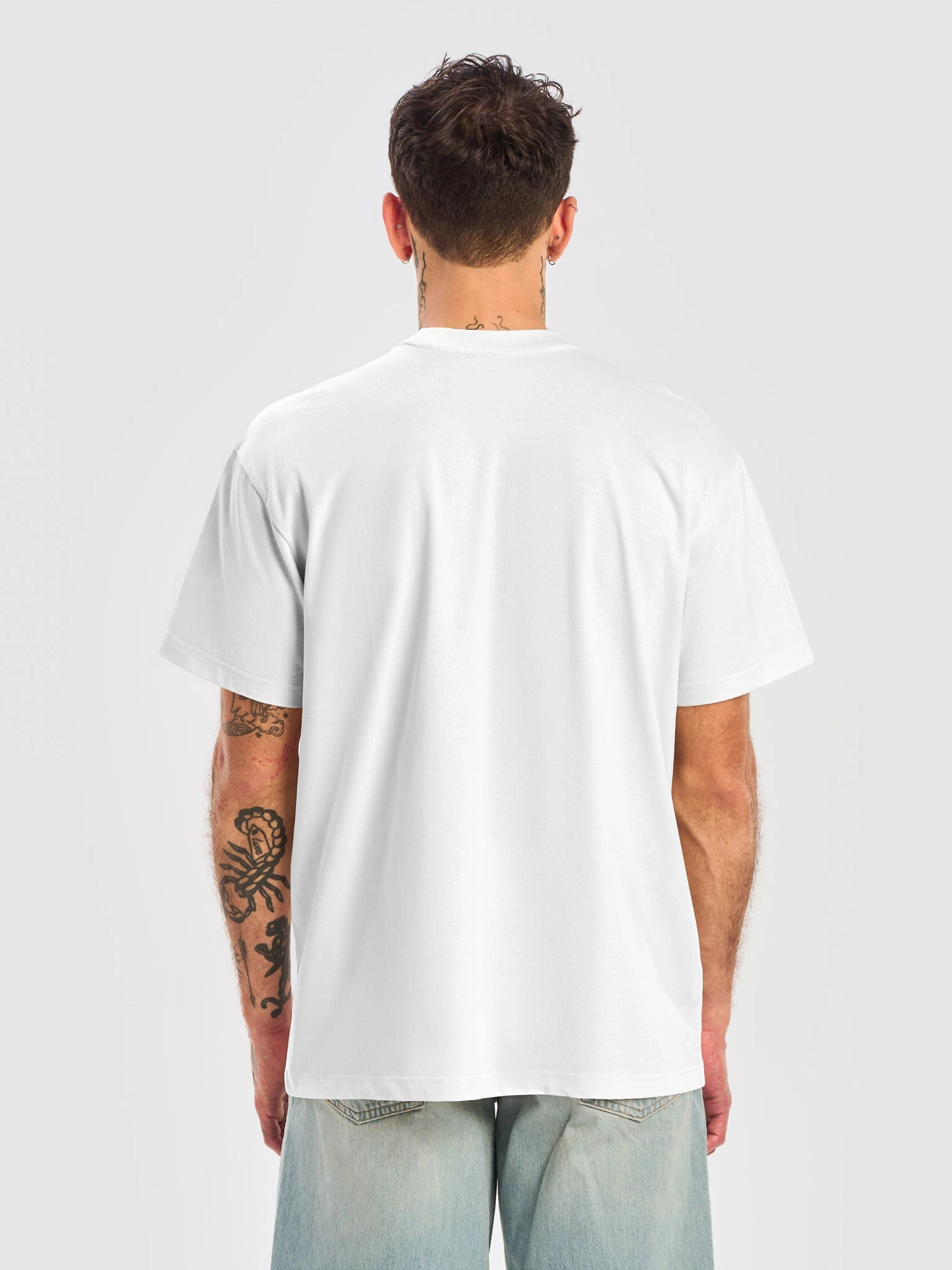
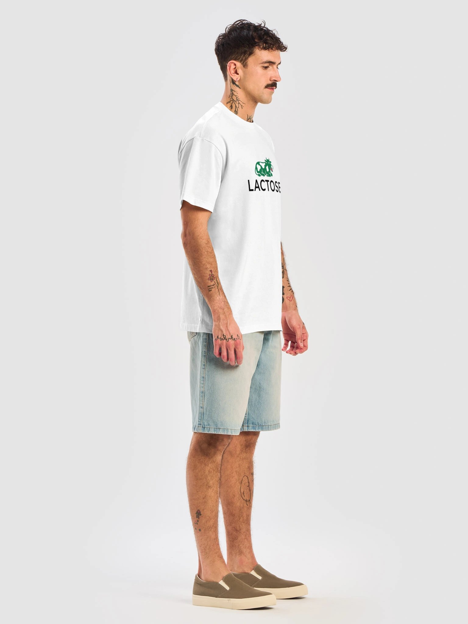
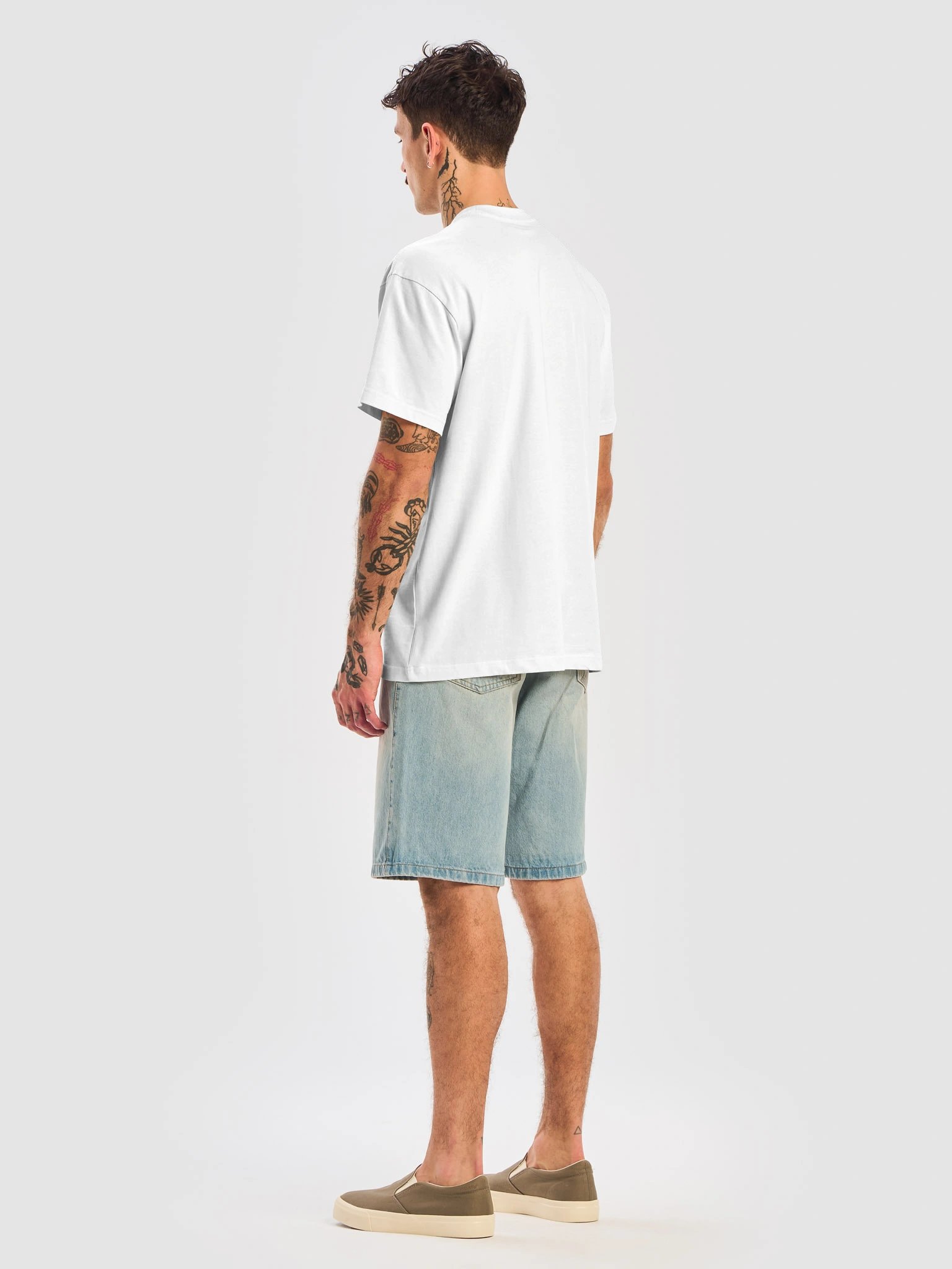
This oversized tee is comfy and stylish, great for both everyday wear and relaxing. Its loose fit and soft fabric make it perfect for lounging, layering, or adding a cool touch to your outfit.
---
Lactose is a parody of Lacoste. Can be worn by lactose-intolerant people too.
Paak is an independent creative brand. Every design is an original work, not affiliated with, sponsored by, or associated with any other brand. Any resemblance to existing brands is used for the purpose of parody, commentary, and satire.

| Size label | Length | Width |
|---|---|---|
|
S
|
28.25
|
22
|
|
M
|
29.25
|
24
|
|
L
|
30.25
|
26
|
|
XL
|
31.25
|
28
|
|
2XL
|
32 1/2
|
30
|
|
3XL
|
33 1/2
|
32
|
|
4XL
|
34.25
|
34
|
Giorgio Armani built an empire on two initials meaning exactly what everyone assumes they mean. Georgia Armenia keeps the letters, changes what they stand for, and lets the hoodie sit there looking almost convincingly Italian while actually being about two different countries entirely. The joke is in the half-second delay before you realize what you just read.
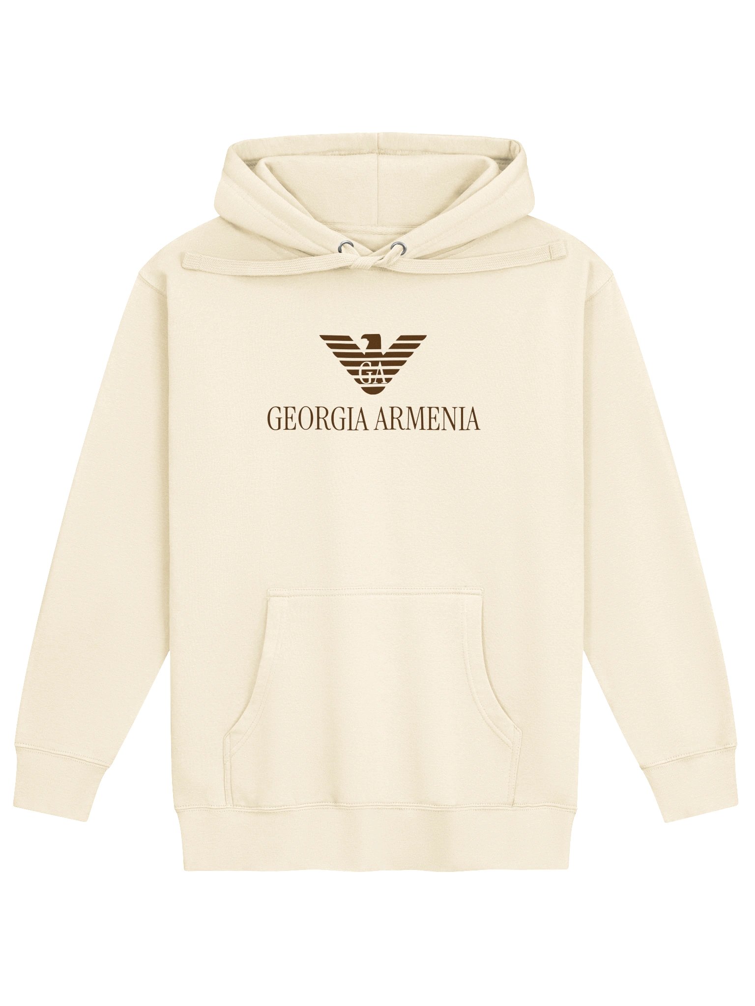
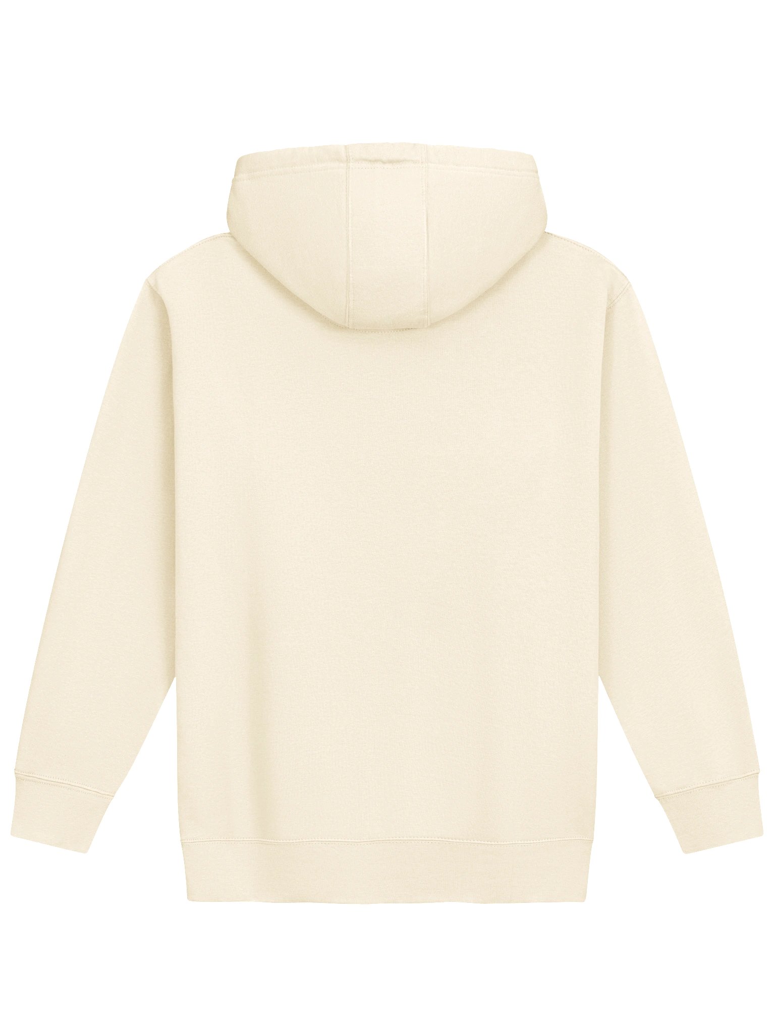
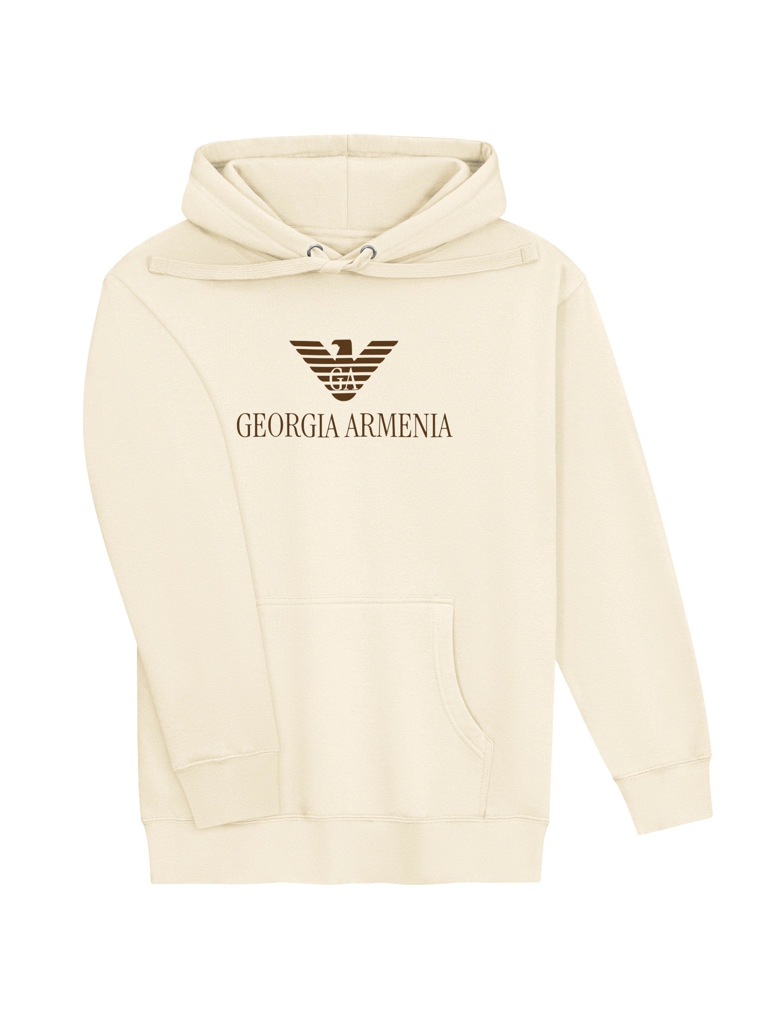

Warning: once you throw this soft-to-the-touch cotton blend hoodie on, you may not want to take it off.
65% ring-spun cotton, 35% polyester
Heavyweight fabric (8.5 oz)
Regular fit but can run a bit tight
Unisex sizing
---
Georgia Armenia is a parody of Giorgio Armani. From Milan to the Caucasus.
Paak is an independent creative brand. Every design is an original work, not affiliated with, sponsored by, or associated with any other brand. Any resemblance to existing brands is used for the purpose of parody, commentary, and satire.
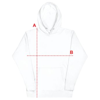
| Size label | Length | Width |
|---|---|---|
|
S
|
27
|
20
|
|
M
|
28
|
21
|
|
L
|
29
|
23
|
|
XL
|
30
|
25
|
|
2XL
|
31
|
26
|
|
3XL
|
32
|
28
|
This one’s the sharpest idea on the list, honestly. A polo shirt is supposed to say something about horses, mallets, and a sport most people who wear polos have never watched, let alone played. “Never Played Polo” just says the quiet part out loud. It’s not really about Ralph Lauren or U.S. Polo Assn. specifically — it’s about the fact that an entire clothing category exists to borrow prestige from an activity almost nobody involved has any relationship with.
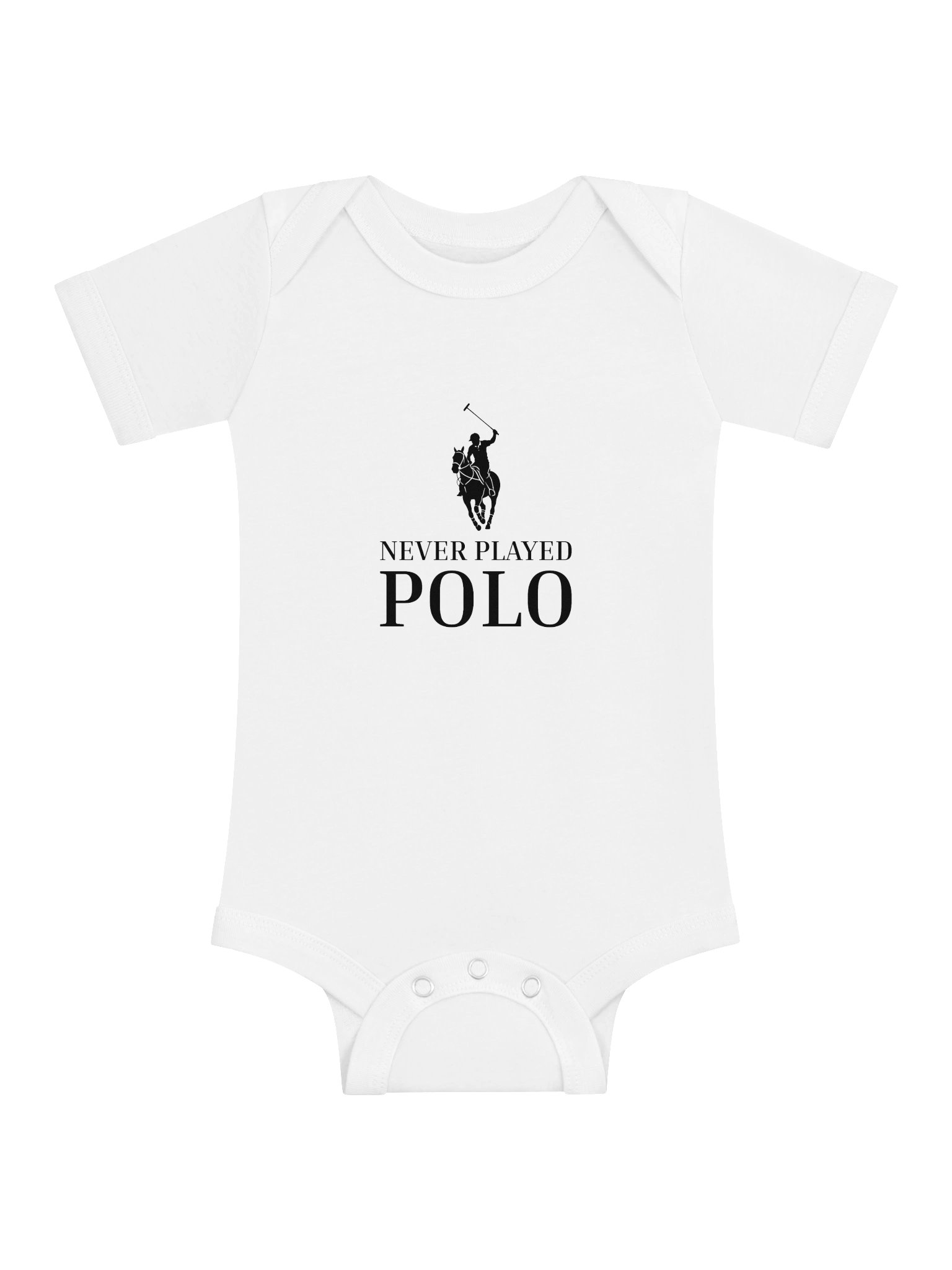
Short sleeve onesie that features Bella Canvas ultrasoft fabric and is designed for active babies.
100% ring-spun combed cotton
Lightweight fabric (3.9 oz)
Fits as expected
---
Never Played Polo is a parody of Polo Ralph Lauren, U.S. Polo Assn., and polo brands in general. Dress like a champion of a sport you've never even watched.
Paak is an independent creative brand. Every design is an original work, not affiliated with, sponsored by, or associated with any other brand. Any resemblance to existing brands is used for the purpose of parody, commentary, and satire.

| Size label | Length | Width | Fits weight (lbs) |
|---|---|---|---|
|
3-6m
|
17
|
9
|
12
|
|
6-12m
|
19
|
9
|
16
|
|
12-18m
|
20
|
10
|
22
|
Balenciaga spent the last decade being simultaneously the most expensive and most memed brand in fashion — $2,000 hoodies that look like they got left in the dryer, that kind of thing. Balanceyoga leans into the “very expensive, very deliberately unbothered” energy but points it at yoga instead of runway shows, which honestly makes more sense as a lifestyle to aspire to.
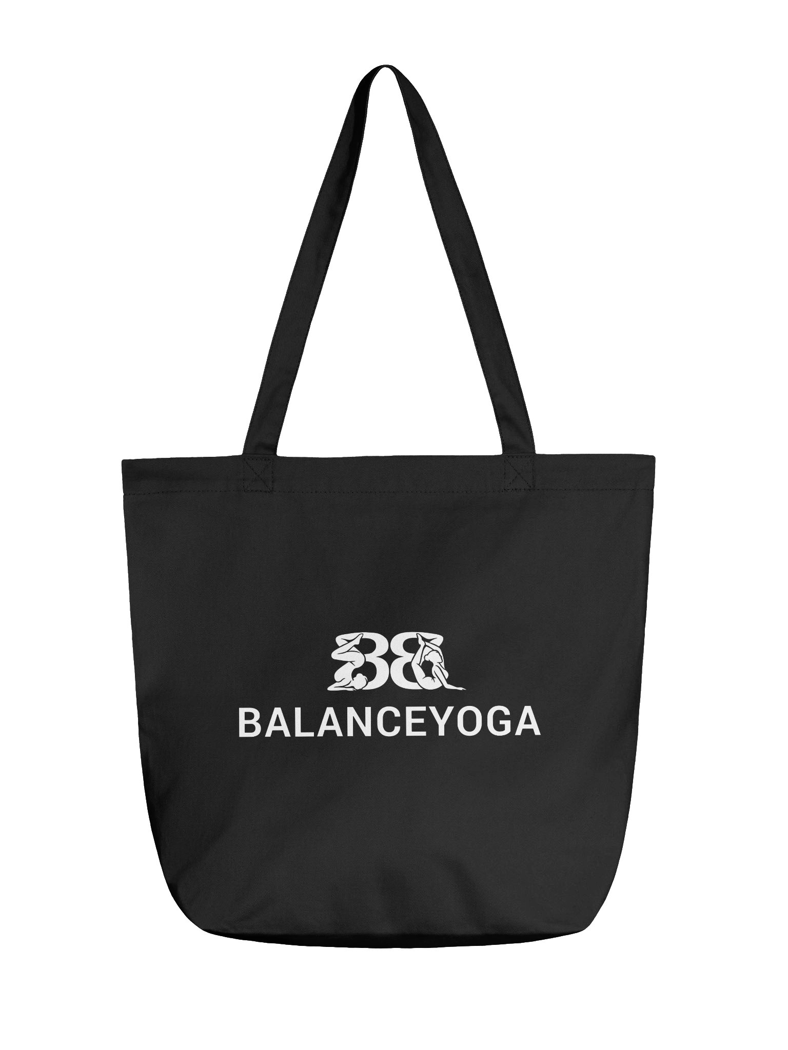
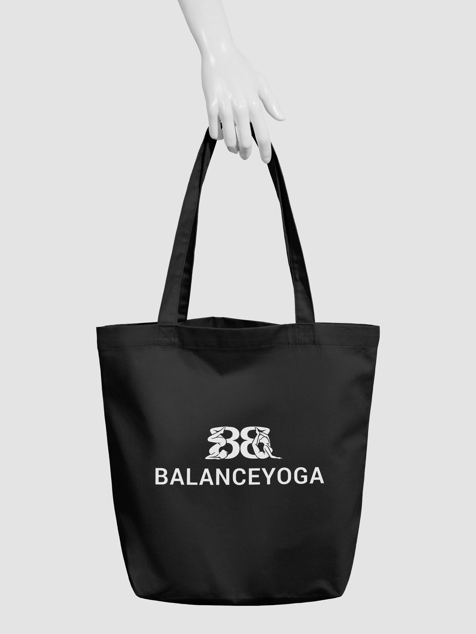
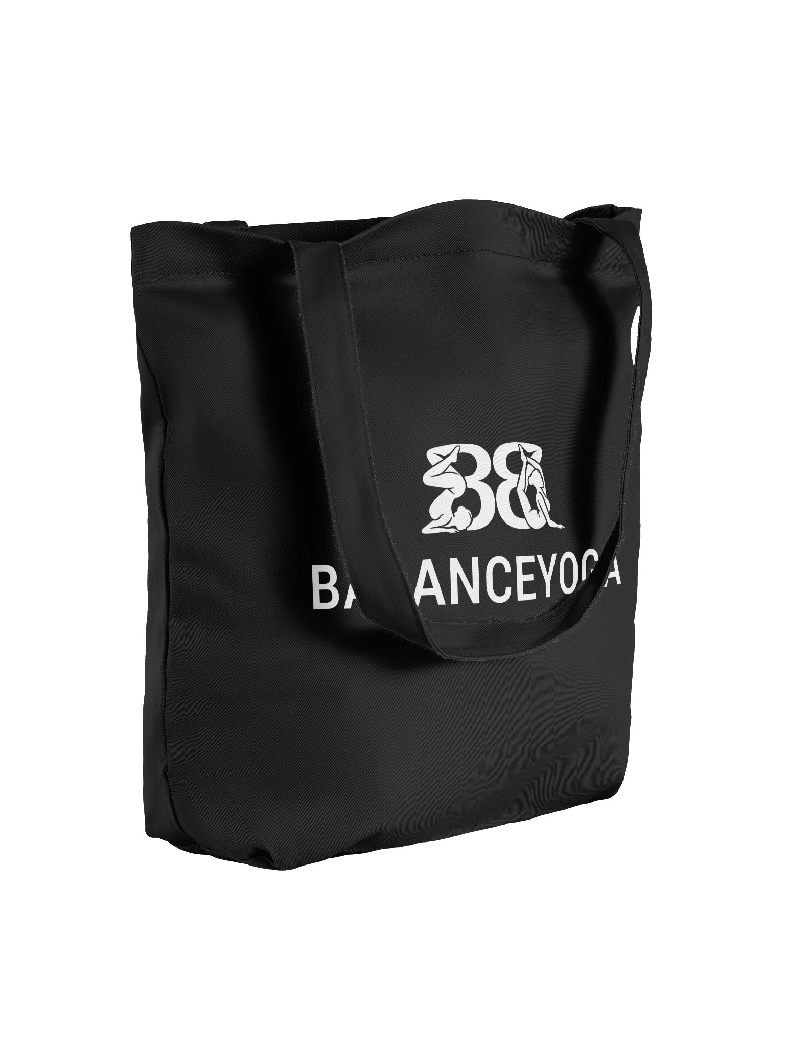
Eco-friendly organic cotton twill tote bag, perfect for showcasing your own unique design! With a large print area and solid color, this roomy bag is both stylish and practical, fitting groceries, books, and more.
---
Balanceyoga is a parody of Balenciaga. Stretch your body, not your budget.
Paak is an independent creative brand. Every design is an original work, not affiliated with, sponsored by, or associated with any other brand. Any resemblance to existing brands is used for the purpose of parody, commentary, and satire.
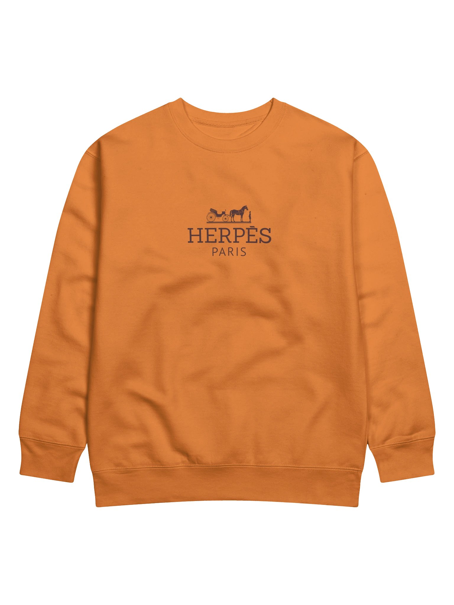
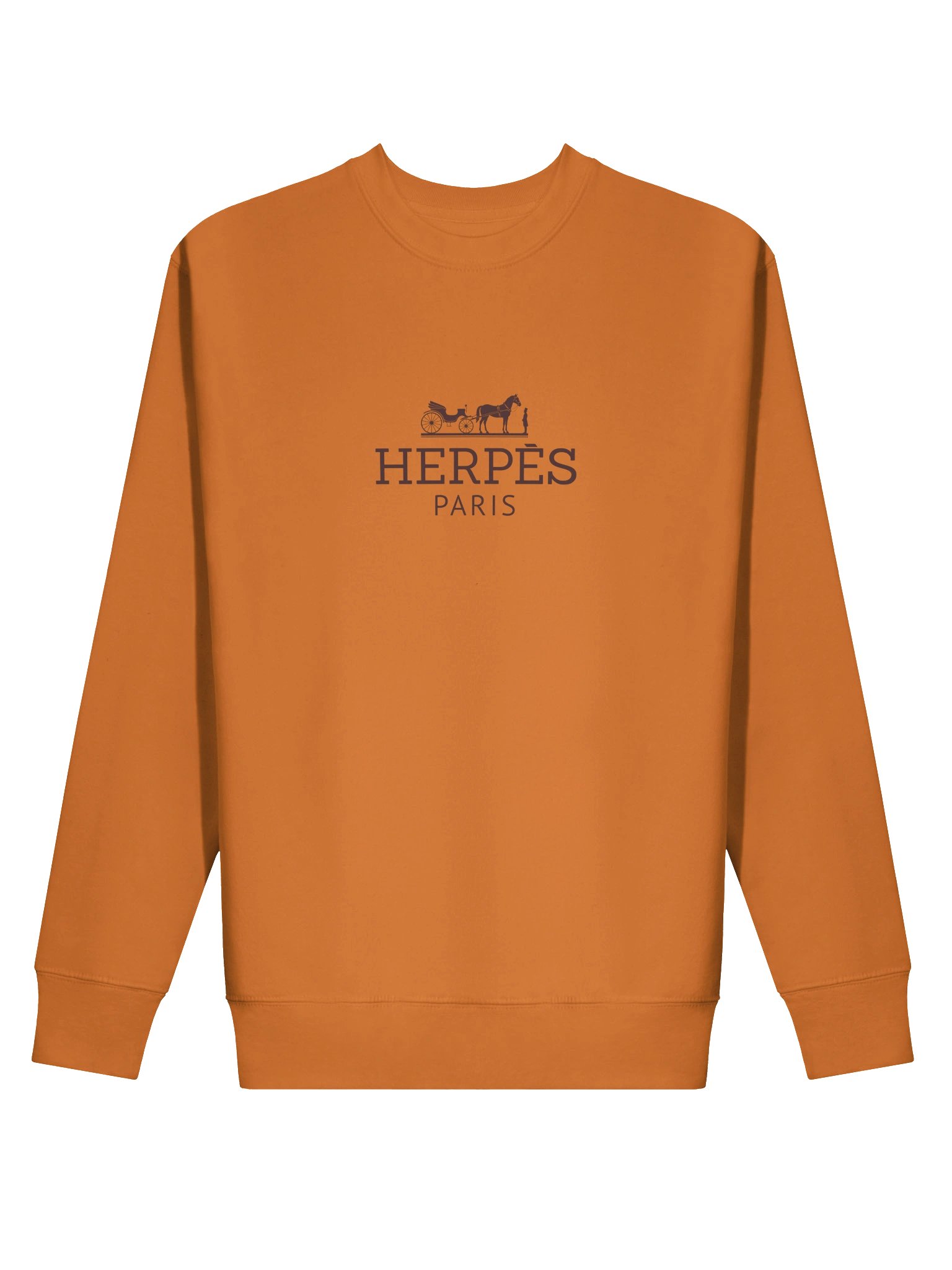
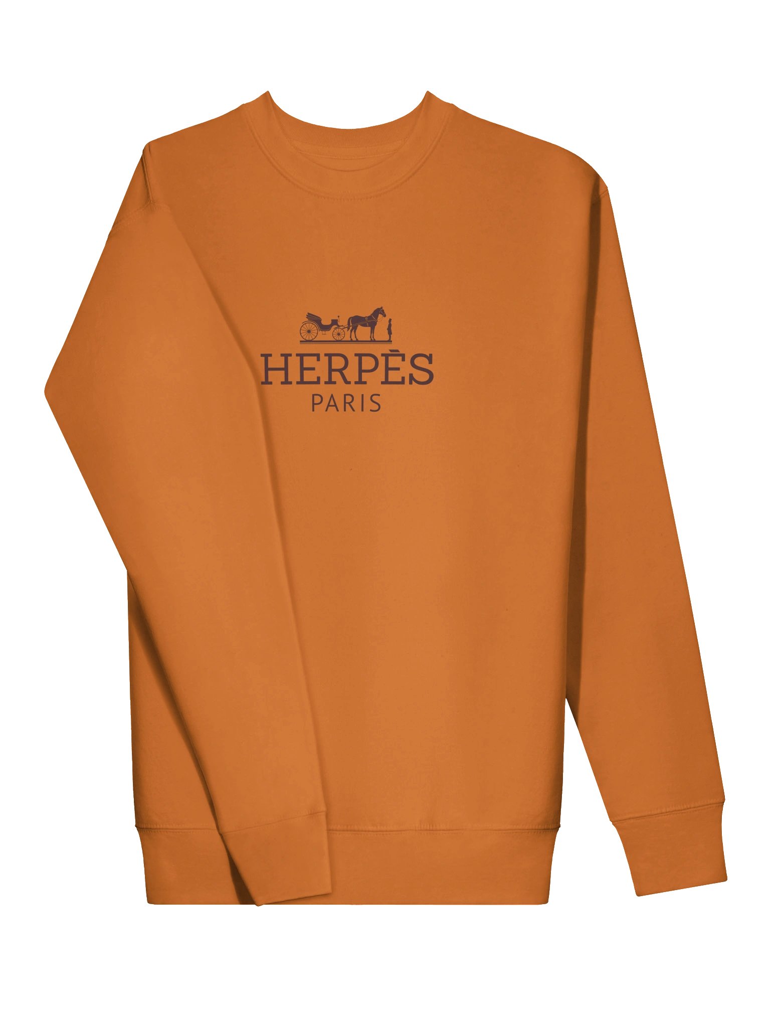
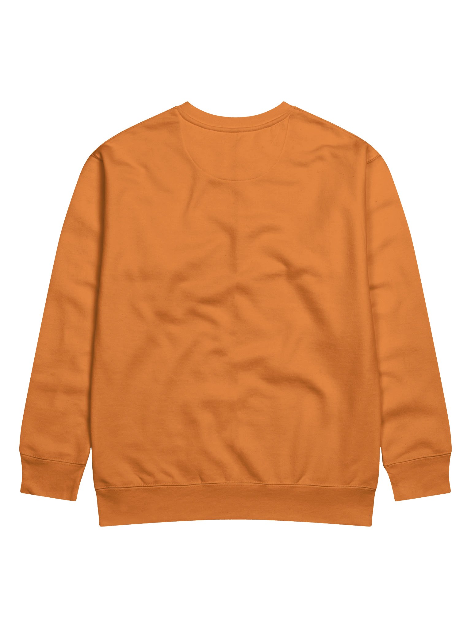
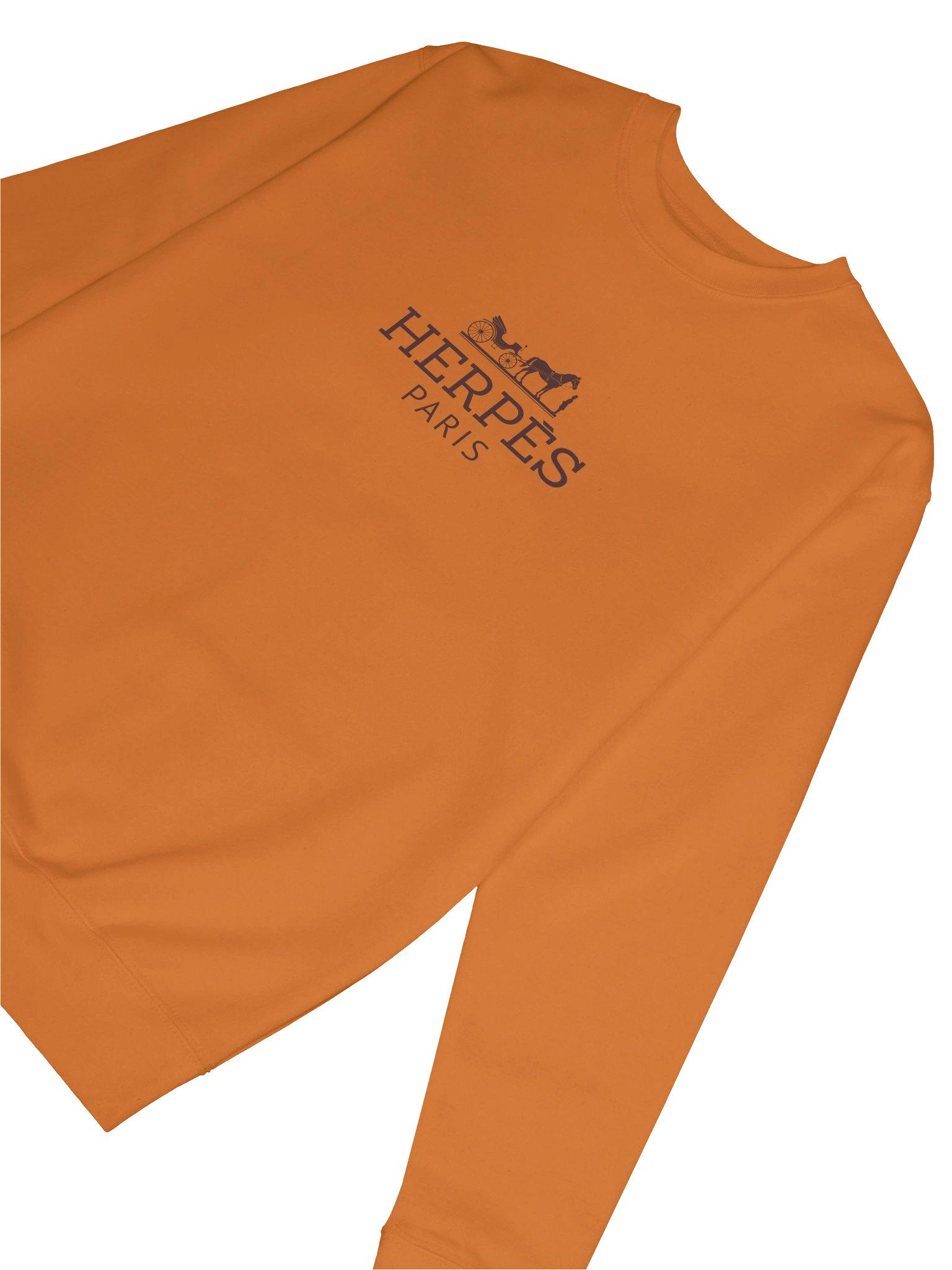
Hermès has spent two centuries turning leather goods into a class signifier so strong that people wait years on a list for a bag. Herpès Paris takes the name apart at the seams — one letter does a lot of work here. It’s absurd in a way that still looks expensive, which is sort of the whole point.
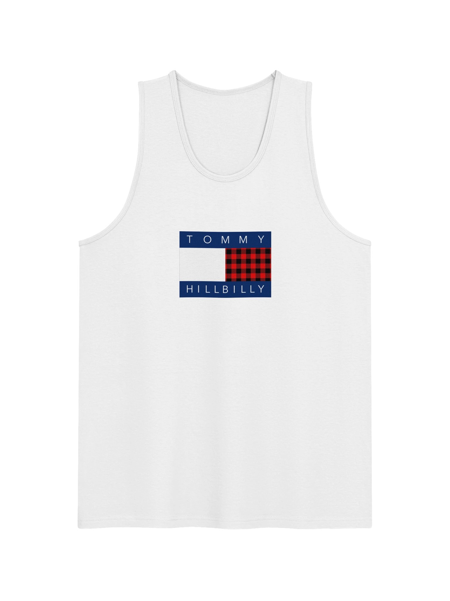
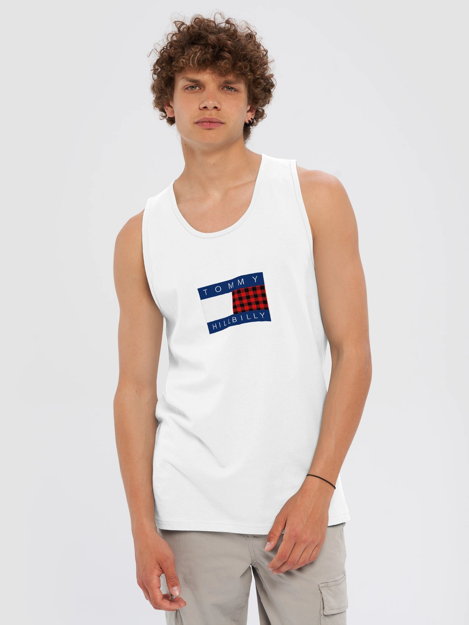
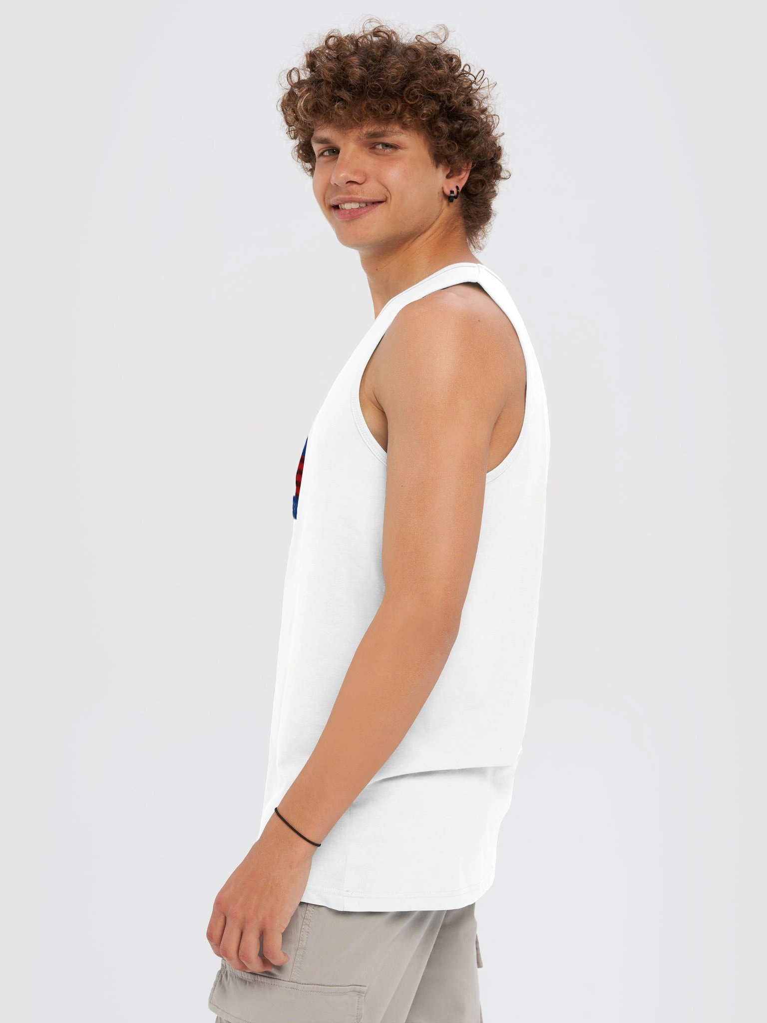
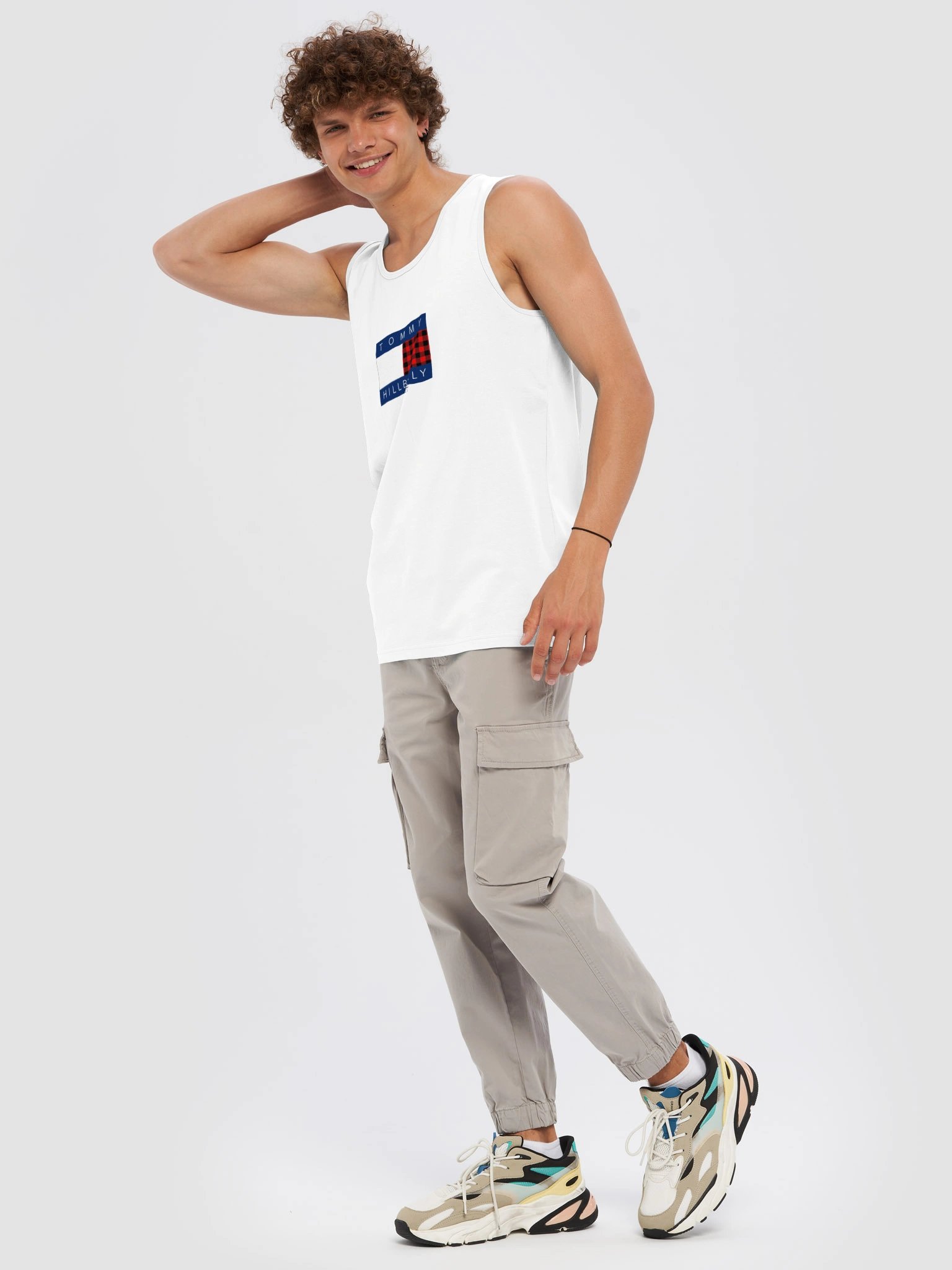
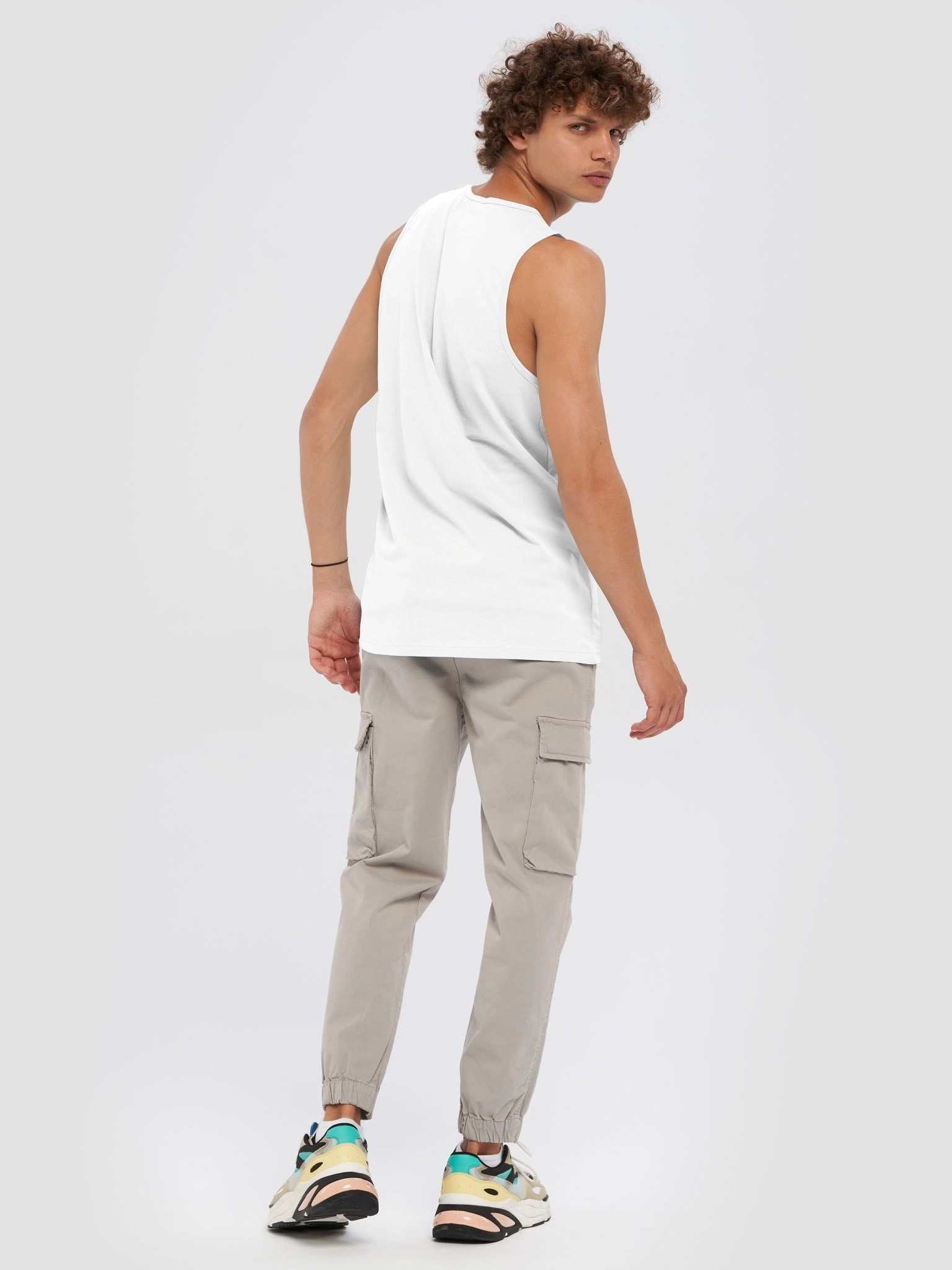
Tommy Hilfiger built its whole identity around preppy East Coast Americana — sailing, flags, that specific shade of “old money” energy. Tommy Hillbilly takes the same visual language and runs it through a red flannel pattern instead, which is a much funnier and arguably more honest version of American style than a yacht club ever was.
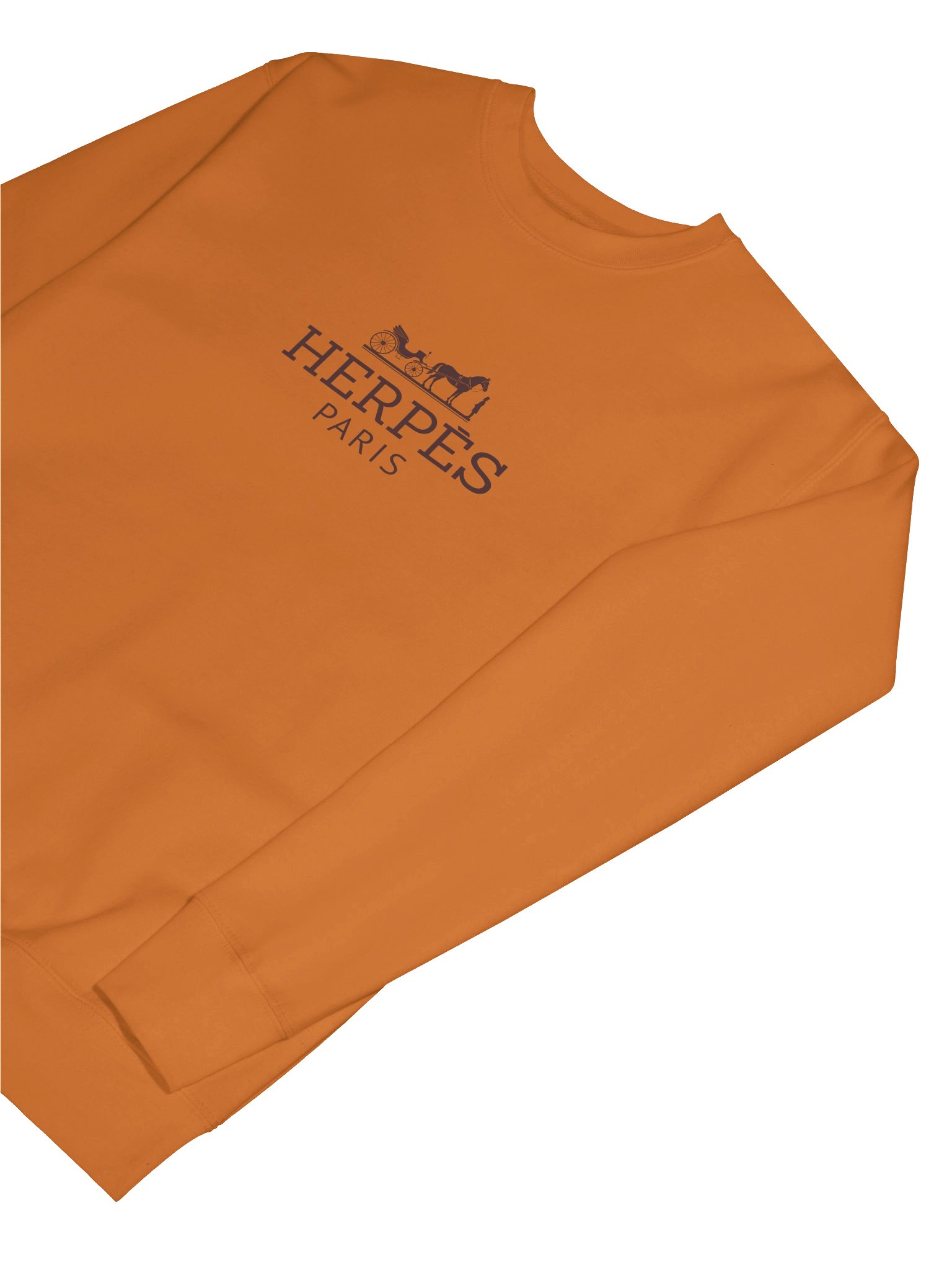
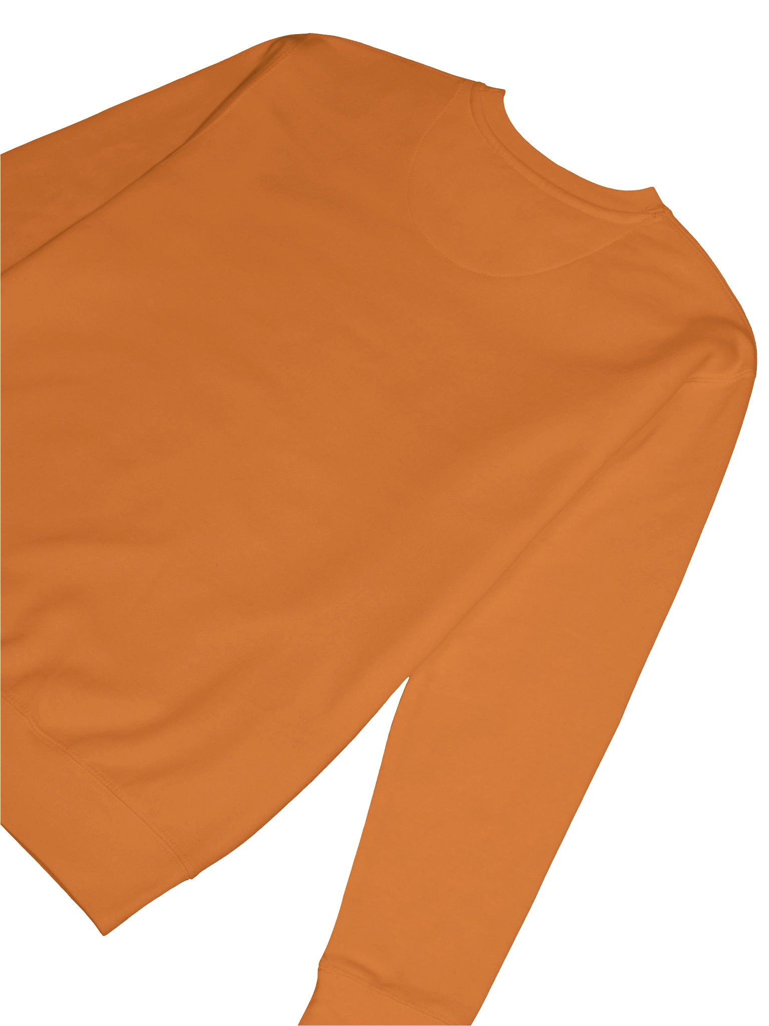
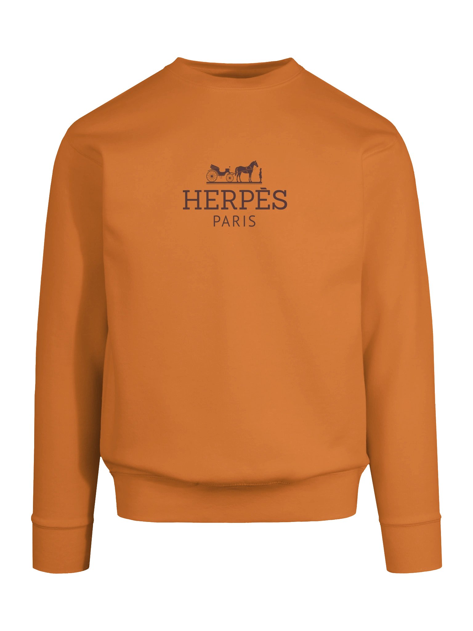
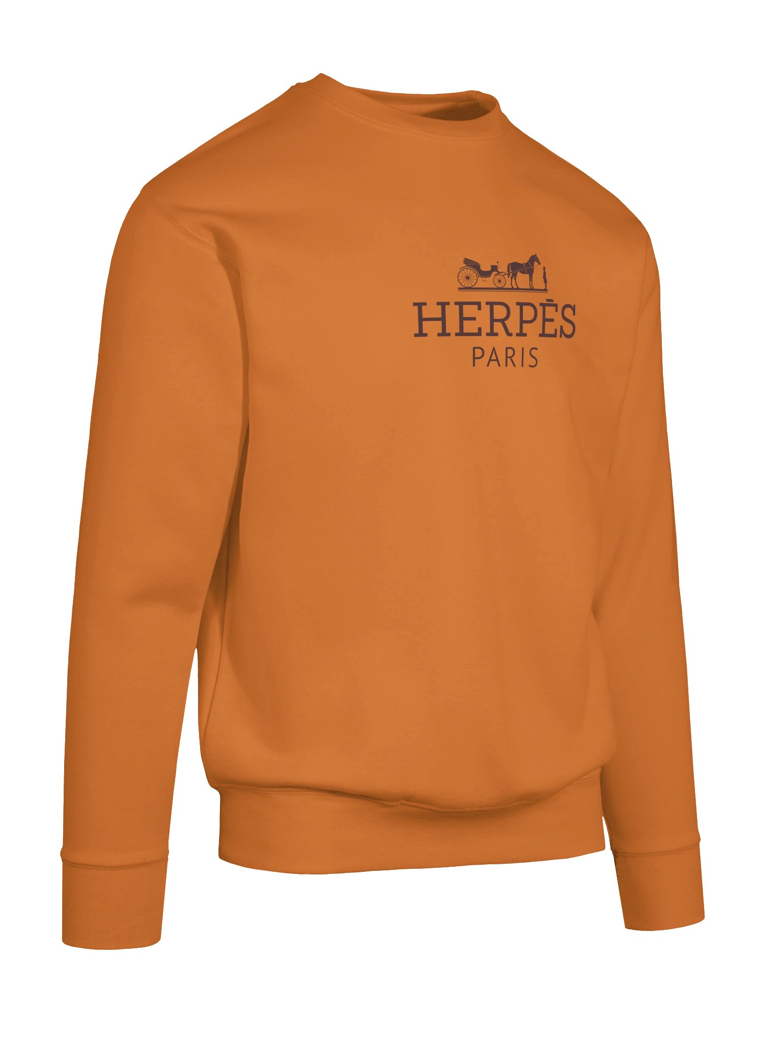
Premium fabrics with a classic fit
---
Herpes Paris is a parody of Hermès. Not affiliated with dermatologists.
Paak is an independent creative brand. Every design is an original work, not affiliated with, sponsored by, or associated with any other brand. Any resemblance to existing brands is used for the purpose of parody, commentary, and satire.

| Size label | Length | Width | Sleeve length |
|---|---|---|---|
|
S
|
27
|
20
|
23 1/2
|
|
M
|
28
|
21
|
24
|
|
L
|
29
|
23
|
24
|
|
XL
|
30
|
25
|
24
|
|
2XL
|
31
|
26 1/2
|
24
|
|
3XL
|
32
|
28
|
24
|
Let them armpits breathe a little
---
Tommy Hillbilly is a parody of Tommy Hilfiger. Trade the yacht for a pickup truck.
Paak is an independent creative brand. Every design is an original work, not affiliated with, sponsored by, or associated with any other brand. Any resemblance to existing brands is used for the purpose of parody, commentary, and satire.
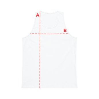
| Size label | Length | Width |
|---|---|---|
|
S
|
28
|
18
|
|
M
|
29
|
20
|
|
L
|
30
|
22
|
|
XL
|
31
|
24
|
|
2XL
|
32
|
26
|
|
3XL
|
33
|
28
|
Bvlgari is Roman jewelry-house gravitas — gold, marble, the kind of brand that names itself after an ancient empire on purpose. Bvlgaria renames itself after an actual country and drops in a warrior mid-Bulgarian split squat as the logo.
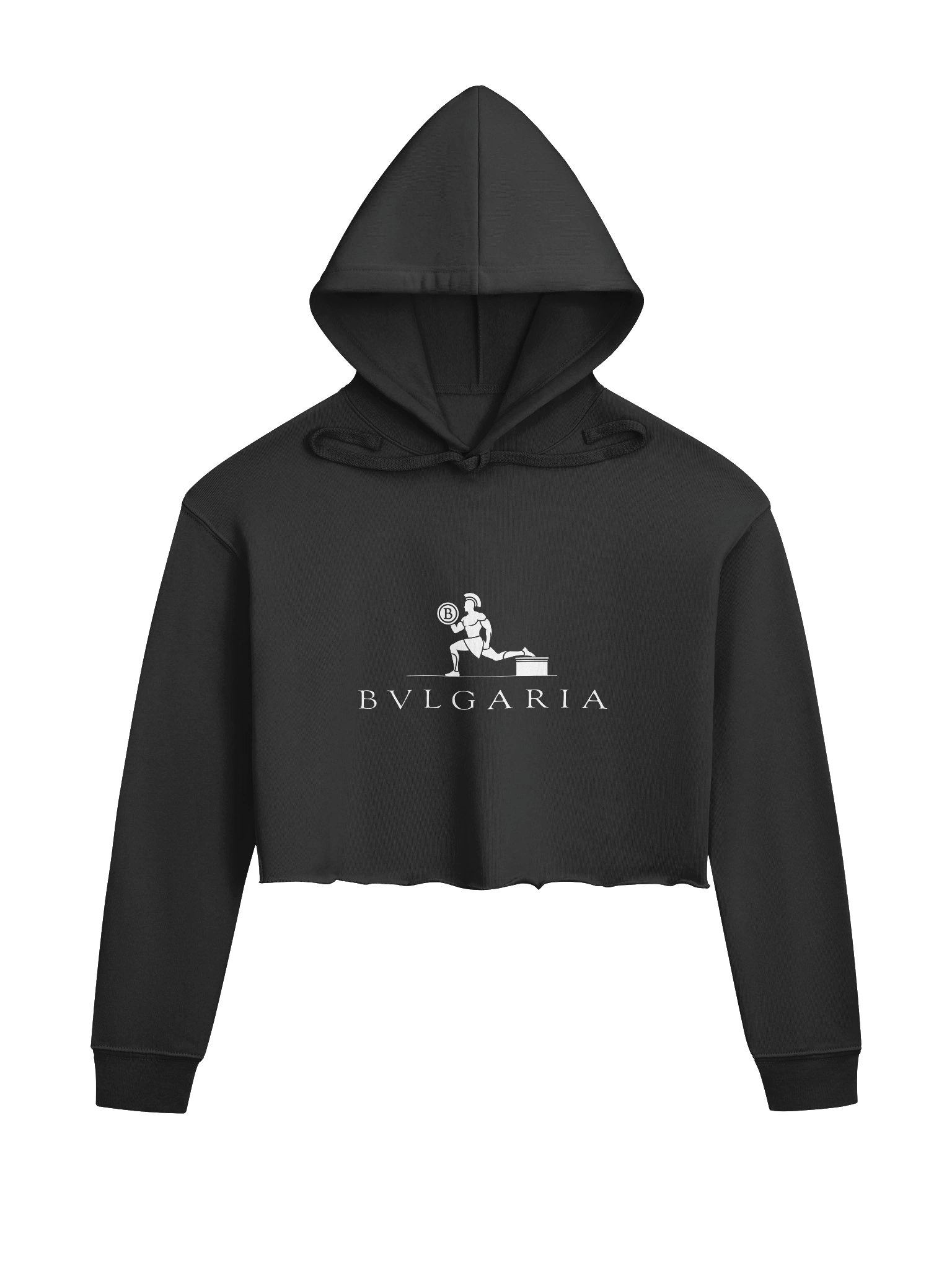
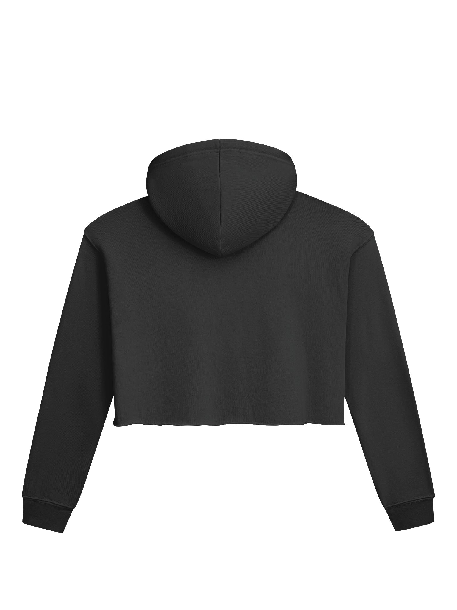
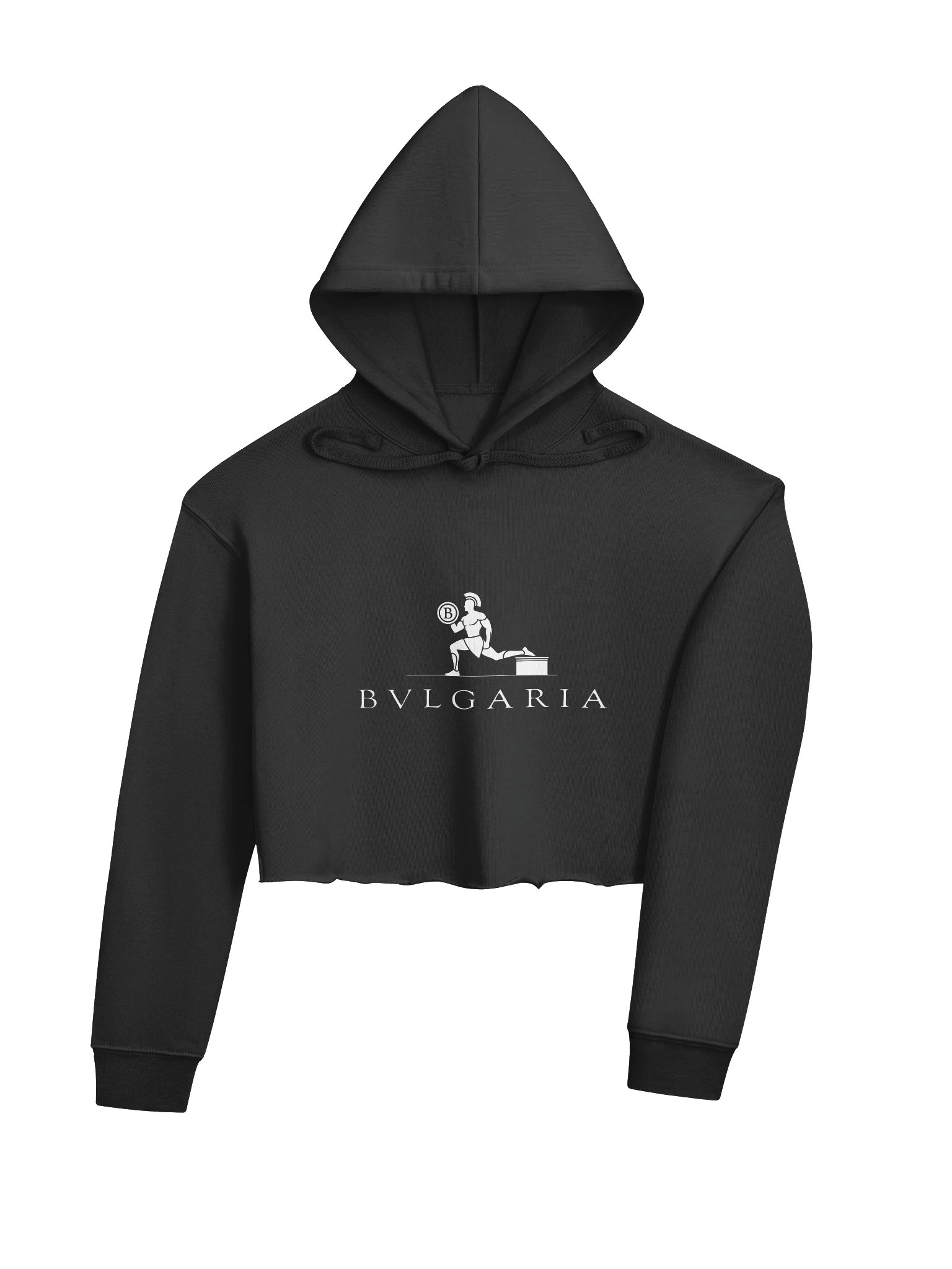
There’s no need to choose between comfy and cute in this super soft cropped hoodie
---
Bvlgaria is a parody of Bvlgari. Brought to you by autocorrect.
Paak is an independent creative brand. Every design is an original work, not affiliated with, sponsored by, or associated with any other brand. Any resemblance to existing brands is used for the purpose of parody, commentary, and satire.

| Size label | Length | Width |
|---|---|---|
|
S
|
18.63
|
22
|
|
M
|
19.38
|
23 1/2
|
|
L
|
21.38
|
25 1/2
|
|
XL
|
22.13
|
27 1/2
|
|
2XL
|
22.88
|
29 1/2
|
Moschino has always played it a little unhinged already — smiley faces, question marks, Jeremy Scott doing whatever Jeremy Scott wants. Moschito meets that energy on its own turf: same rhythm as the name, but the logo’s a mosquito instead of a teddy bear.
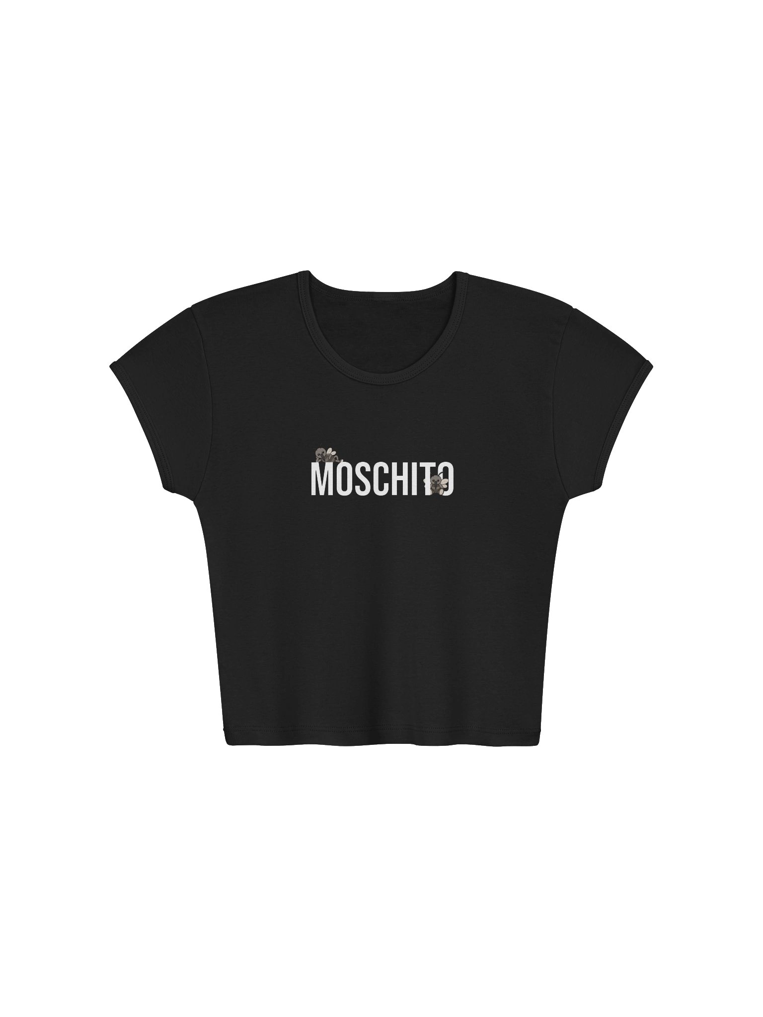
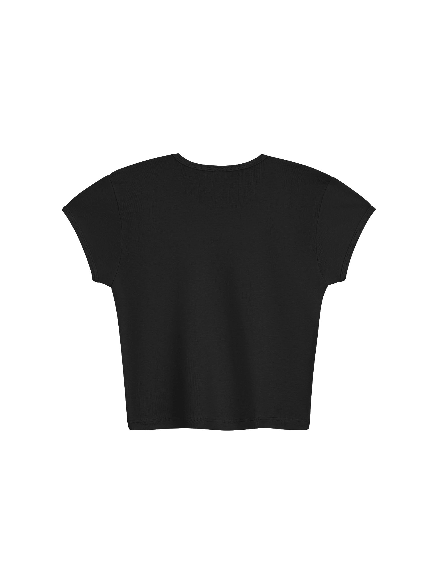
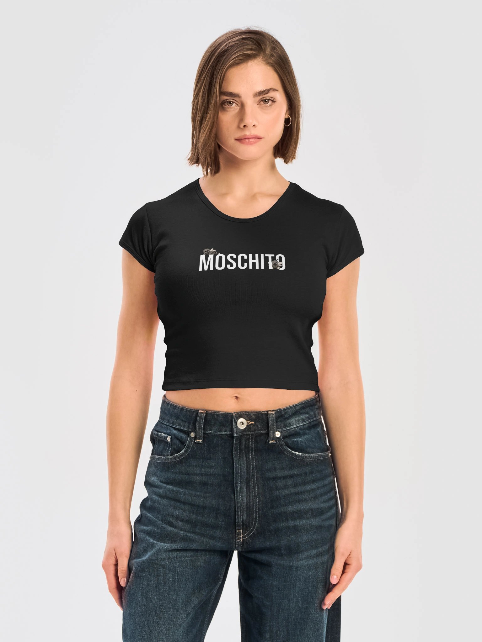
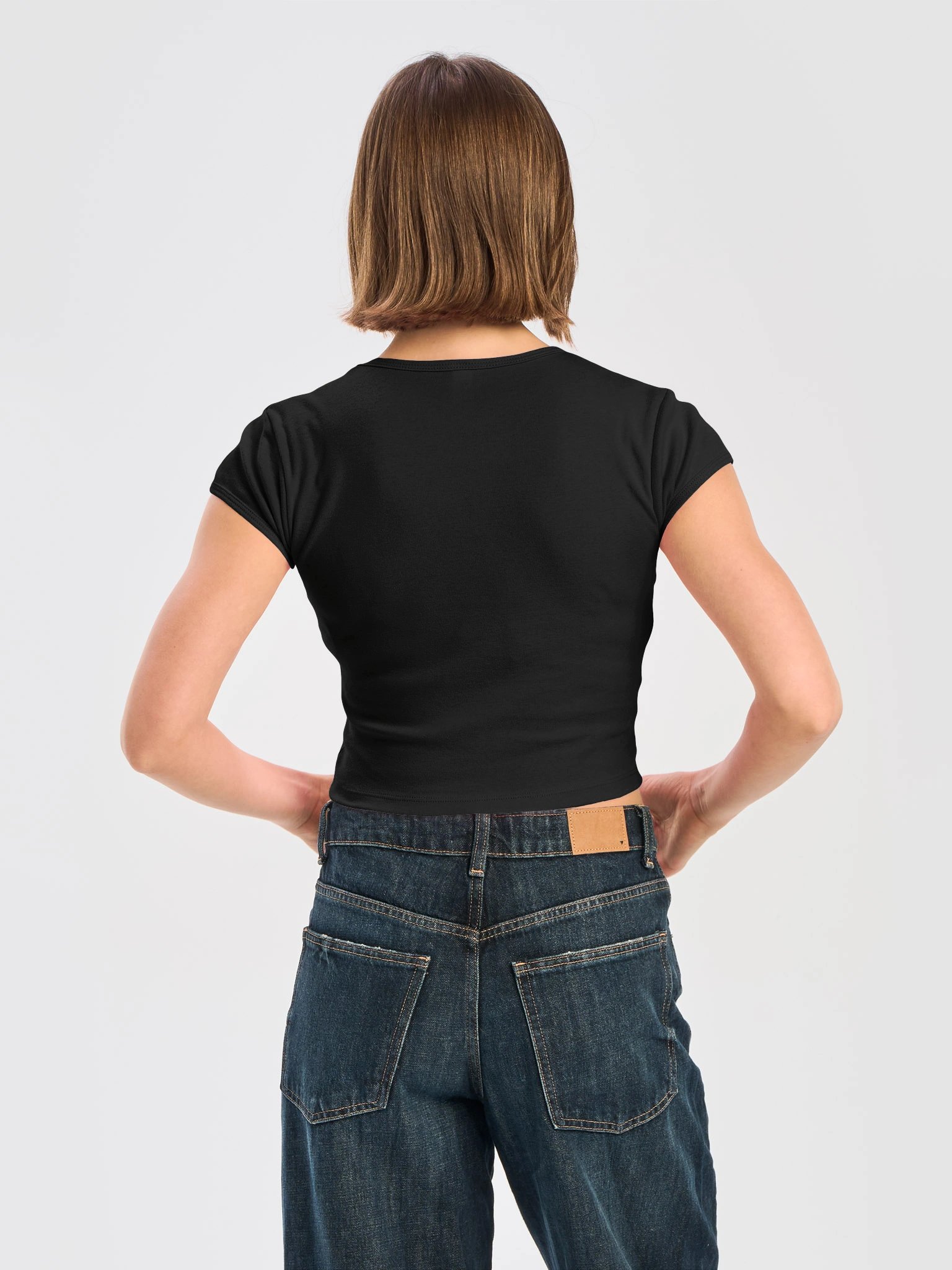
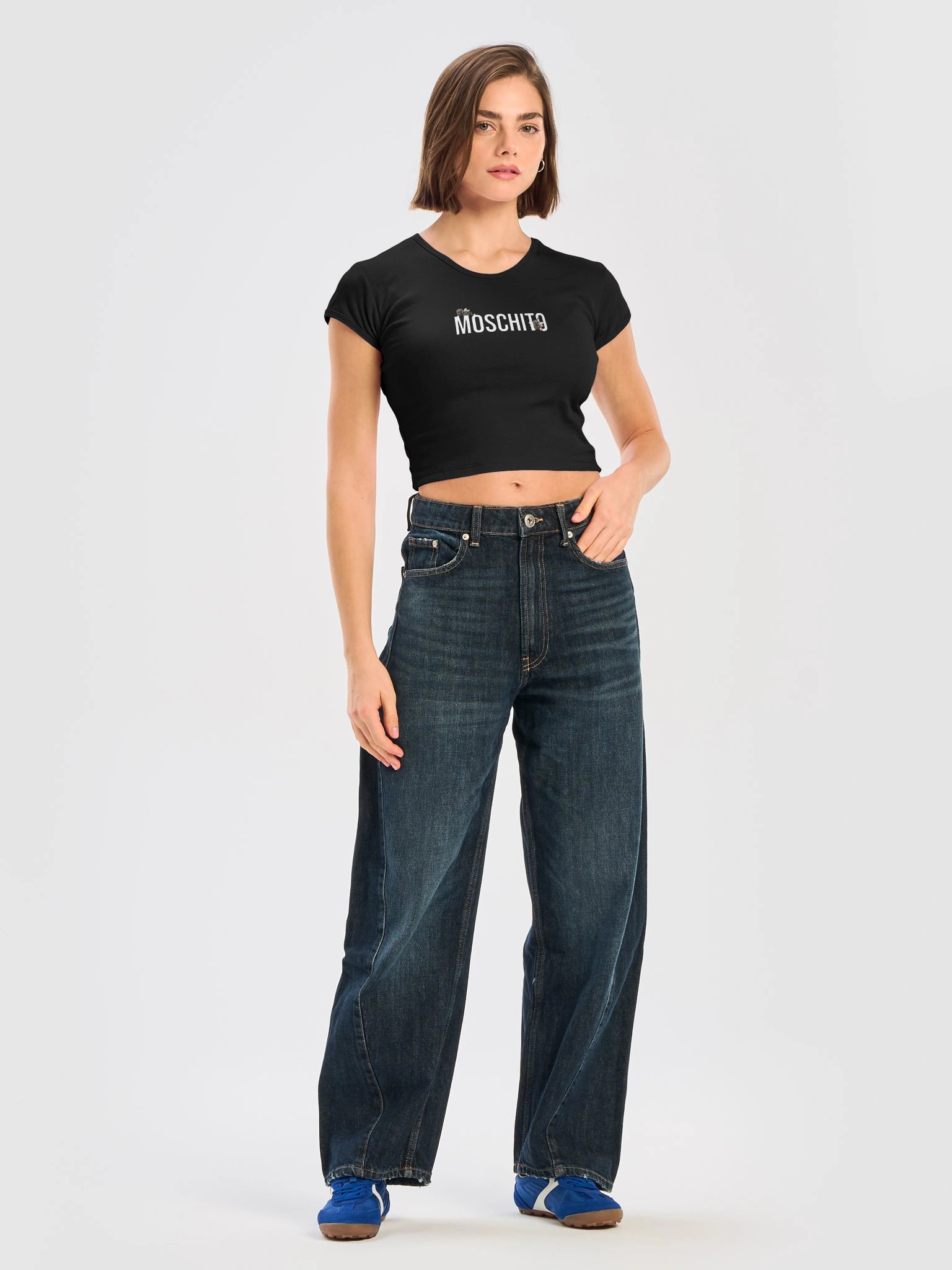
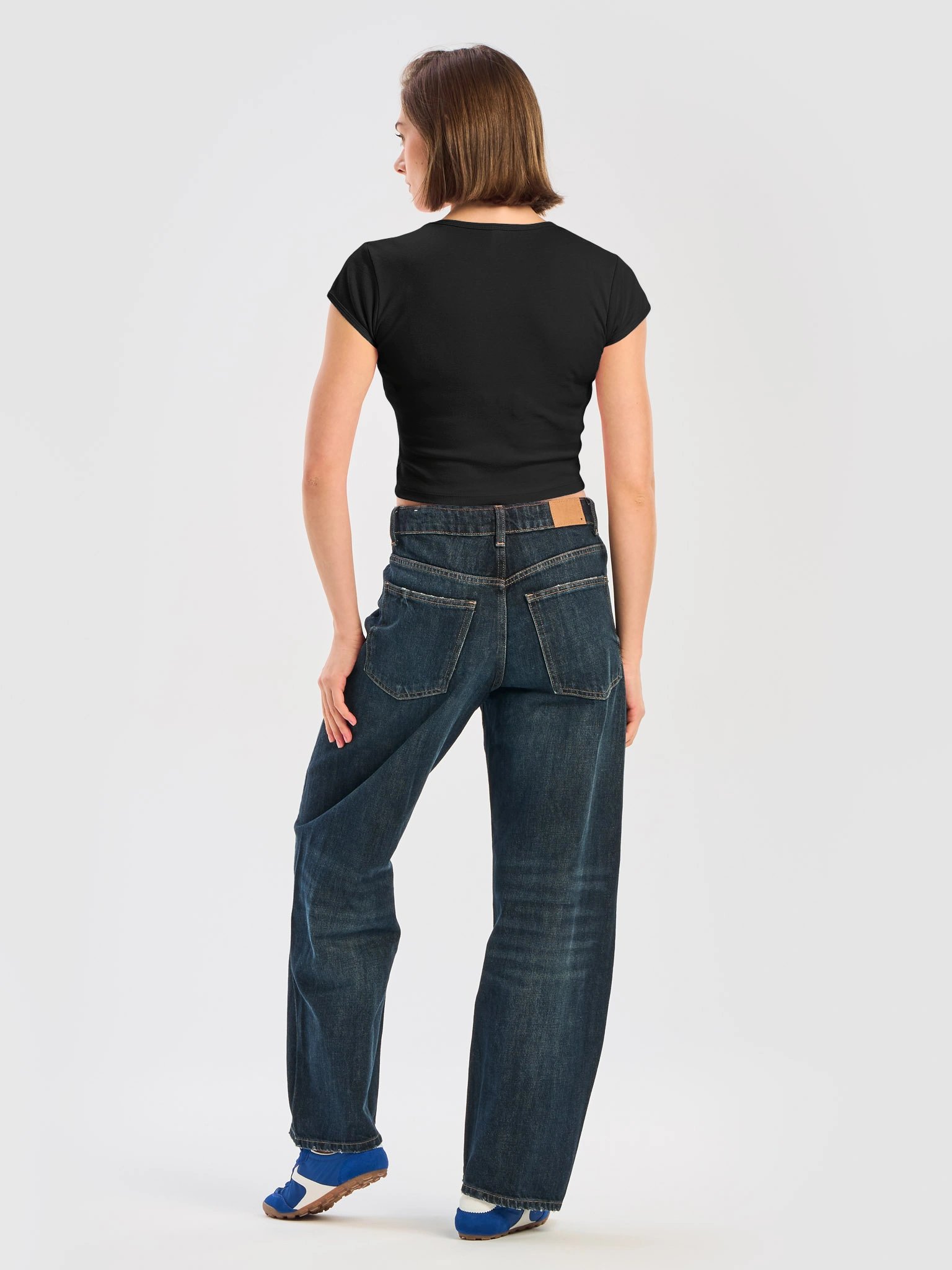
This combed cotton baby tee is made of soft 30 singles yarn and stretches up to 2 times its original size. This 100% cotton style shrinks 7% in wash and this style has been designed to fit before and after wash. Made in Los Angeles, California.
---
Moschito is a parody of Moschino. The only mosquito that's actually cute.
Paak is an independent creative brand. Every design is an original work, not affiliated with, sponsored by, or associated with any other brand. Any resemblance to existing brands is used for the purpose of parody, commentary, and satire.

| Size label | Width | Length |
|---|---|---|
|
S
|
13.625
|
17
|
|
M
|
14.625
|
17 1/2
|
|
L
|
15.625
|
18
|
|
XL
|
16.625
|
18 1/2
|
Givenchy is untouchable French luxury — Audrey Hepburn, couture, the whole vocabulary of restraint and taste. Givenshi is not interested in restraint. The name reads as exactly what it sounds like, and the slogan, “Real Paris Shi,” commits to the bit instead of winking at it.
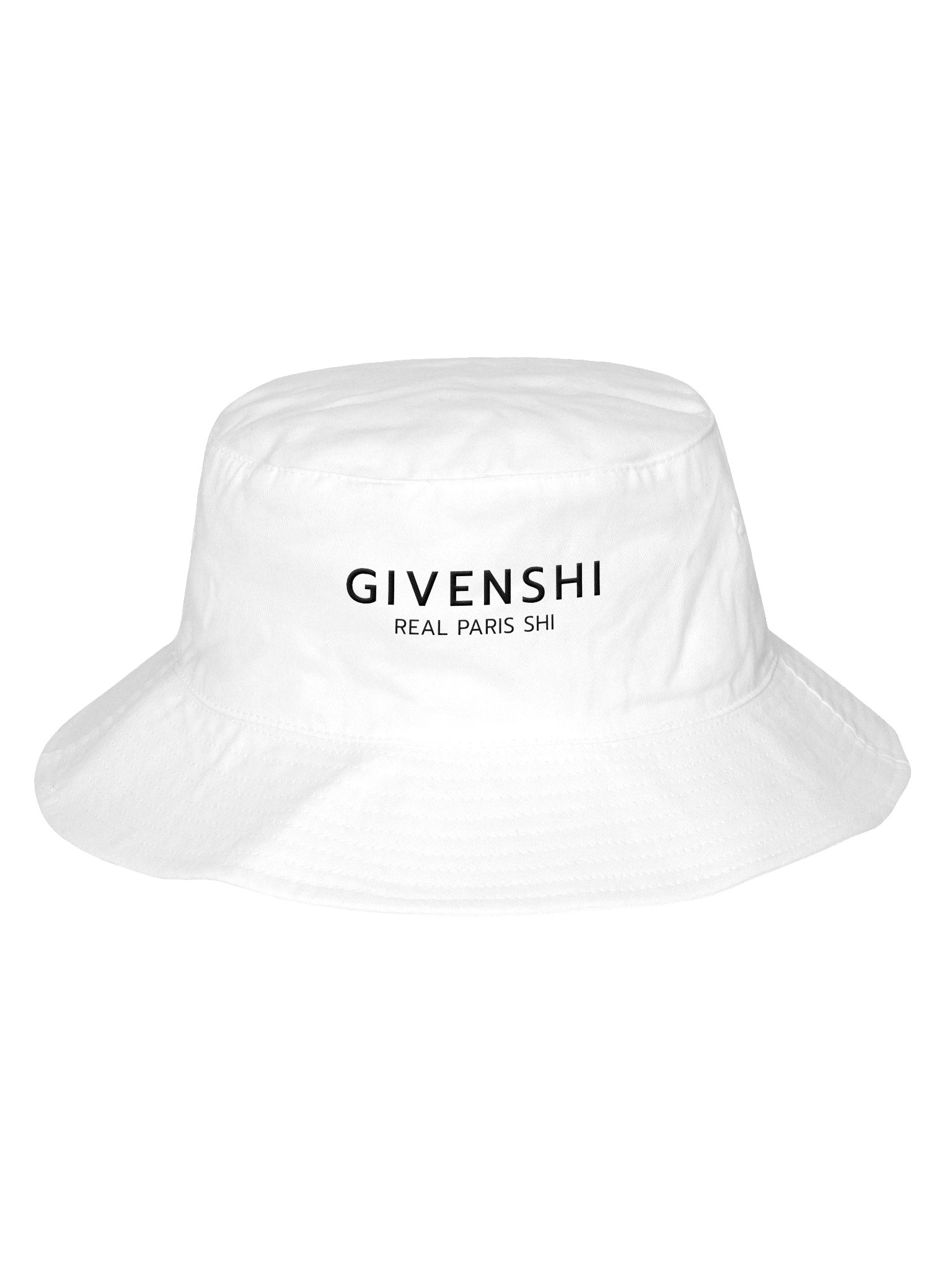
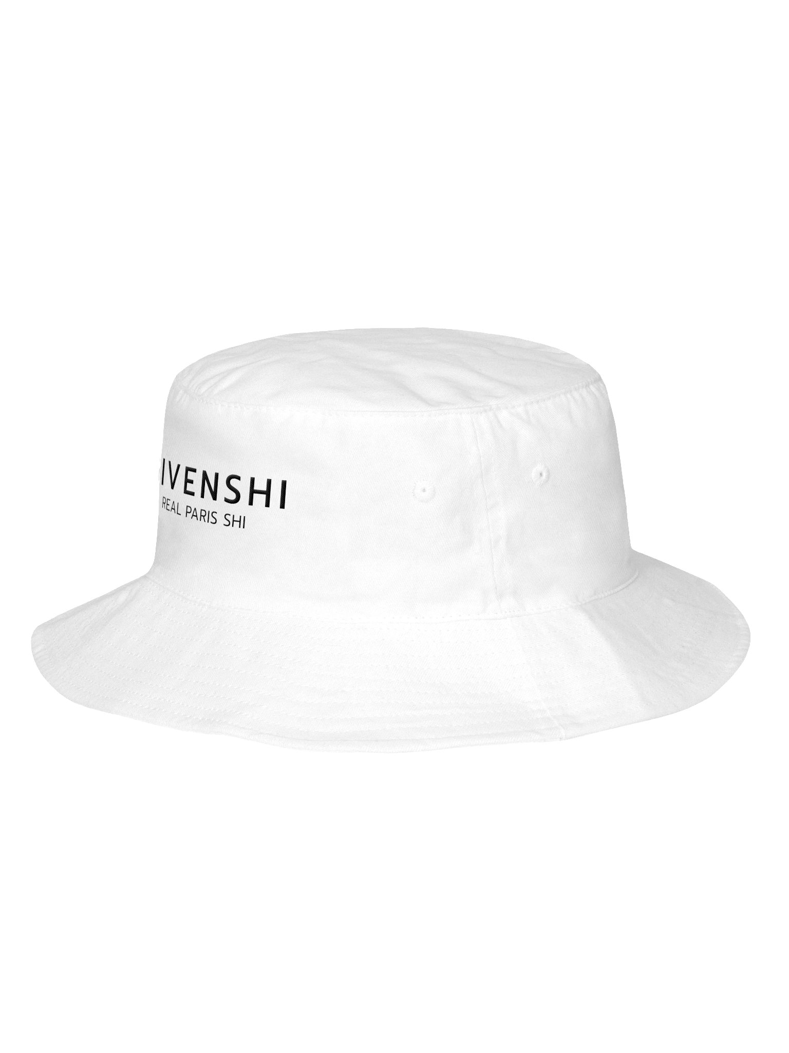
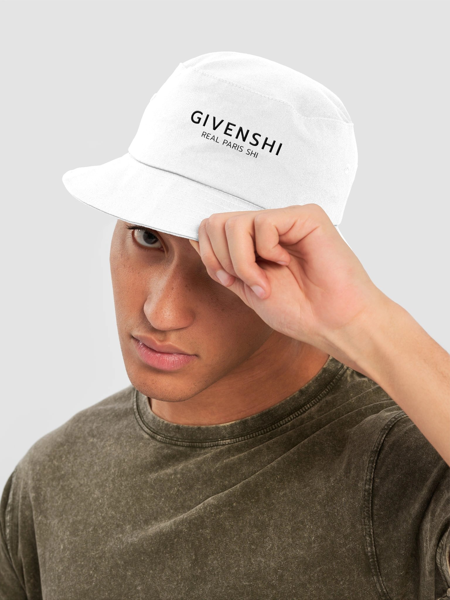
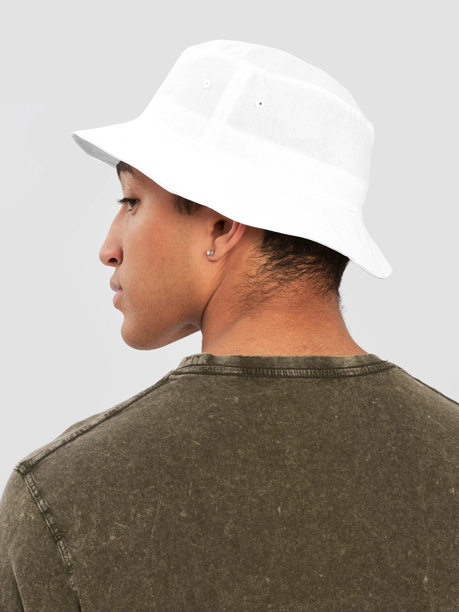
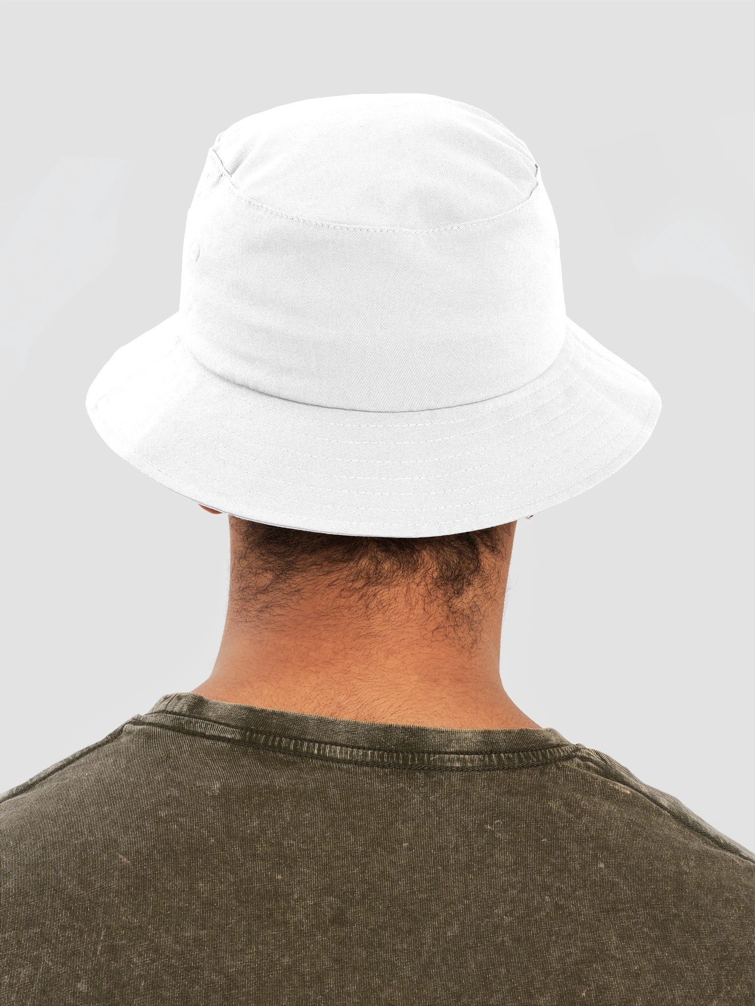
This mid-profile, one-size-fits-all bucket hat checks all the boxes, from streetwear to girly glam.
---
Givenshi is a parody of Givenchy. You were promised luxury. You were given shi.
Paak is an independent creative brand. Every design is an original work, not affiliated with, sponsored by, or associated with any other brand. Any resemblance to existing brands is used for the purpose of parody, commentary, and satire.

| Size label | A | B | C |
|---|---|---|---|
|
One size
|
21.25
|
3.14
|
2.56
|
None of these are really about the specific brands. They’re about the habit — buying a name because of what it’s supposed to say about you, rather than because you actually like the object. Paak just makes that transaction a little more honest, and a little funnier to look at while you’re doing it.